|
|
Post by Troian Bellisario on Feb 17, 2012 0:56:38 GMT -5
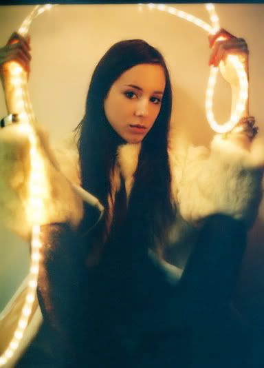
I like this photo. It's very experimental and i like how it has an artistic vibe to it. Its like playing with a piece of art work but incorporates myself in the artwork. I also like how the quality of the photo adds to the assignment and how the lights almost seem to illuminate the photo.  |
|
|
|
Post by Bethany Joy Galeotti on Feb 18, 2012 6:39:13 GMT -5
Beth: The concept is unique. But I wish we could see more. The outfit, styling and other elements in your photo!!! It's too moody and gloomy, Troian. I like those lighting though..
|
|
|
|
Post by Anna Wintour on Feb 18, 2012 8:17:48 GMT -5
Anna: I'm trying to figure out if you simply can't tell when lighting is horrendous in a shot, or if you just don't care, but this really is god awful. Because of the lighting and quality of the image, most of you looks like a blob, but at least your beautiful face manages to shine through the mess I suppose. I know the photograph itself could be considered artistic and challenging conventions...but this is not a photography competition, this is a MODELING competition, and for the second week in a row, I can barely see you.
|
|
|
|
Post by Amanda Kimmel on Feb 18, 2012 14:10:12 GMT -5
Amanda: Sorry Troi, but this is the end of the road for you. I love the lighting tube and how it adds something... but I really can't figure out what that something is due to the atrocious quality of this. I can't see your clothes well, but they look like an everyday outfit. This is an artistic idea, but it's just the lighting. You add nothing. The quality is such a big issue here... sorry :/
|
|
|
|
Post by Troian Bellisario on Feb 18, 2012 14:13:17 GMT -5
God all your comments are making me angry i see peoples photos who dont follow the theme and end up getting first call out or not being eliminated and then when someone who follows the theme cus it's actually something their studying in college and being told its not what it is just doesnt make any sense to me... i just dont understand the judging aspect of this shoot... maybe i should have submitted a photo with great quality that has nothing to do with the topic... sorry for following the topic (and just for the record im not being a bitch im just stating something, i was told in another game that i was being rude when i was just fighting for what i believe in).
|
|
|
|
Post by Anna Wintour on Feb 18, 2012 15:13:38 GMT -5
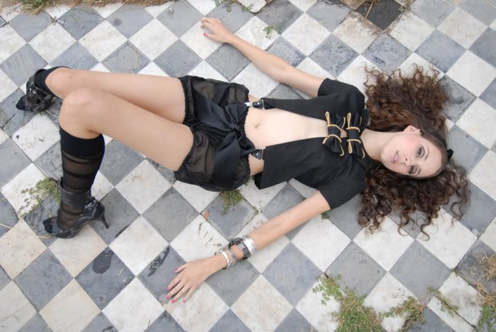
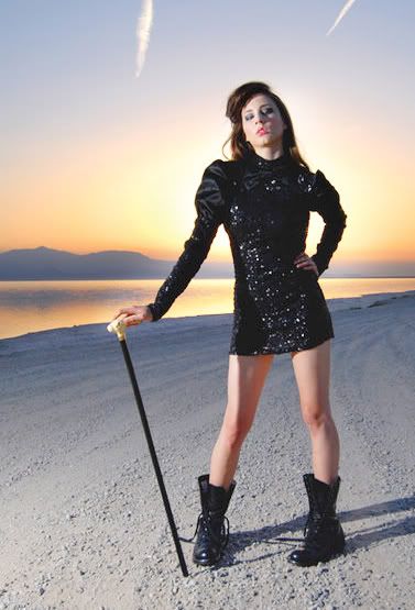
God all your comments are making me angry i see peoples photos who dont follow the theme and end up getting first call out or not being eliminated and then when someone who follows the theme cus it's actually something their studying in college and being told its not what it is just doesnt make any sense to me... i just dont understand the judging aspect of this shoot... maybe i should have submitted a photo with great quality that has nothing to do with the topic... sorry for following the topic (and just for the record im not being a bitch im just stating something, i was told in another game that i was being rude when i was just fighting for what i believe in). I completely respect your opinion Troian, but rather than just insisting that this fits the theme, why don't you explain to us how your pose, hair, make-up, and outfit is avant-garde ("experimental or in advance of that which is generally accepted")? Now, I realize you are one of the models that doesn't exactly have an ocean of images at your disposal, but I did a bit of poking around, and came across these...   And, if you still insist that your "light rope" idea is best, why didn't you pick one where we could at least see you and your clothes just a bit better?  |
|
|
|
Post by Troian Bellisario on Feb 18, 2012 15:39:20 GMT -5
Thank you Anne... i respect what you said and i love the examples... i was gonna go for the last one but for some reason it just looked plain... i guess i just screwed myself this shoot...
|
|
|
|
Post by Joan Rivers on Feb 18, 2012 16:06:06 GMT -5
Joan: I am in the middle with this photo. I hate how we don’t get any fashion in this photo, and by the looks of it, it looks like you’re wearing a tank and shorts. I like your pose and facial expression but this photo shoot was the opposite of looking like a plain Jane and you managed to look like a plain Jane. The usual thing in this photo is the lights and yeah the quality is not it’s best but I think it is what makes this photo usual however it does not complement you though.
|
|