Post by Bethany Joy Galeotti on Feb 25, 2012 5:48:26 GMT -5
Hello Girls!!!
Welcome to Spain. Only two weeks before we crown the Winner for this cycle. Another great week for us.
Let's start our judging session

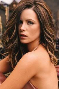
Joan: This looks like you are posing for a Spanish painter or photographer. This reminds me of the movie Vicky Christina Barcelona. I like this photo and I get the Spain vibe here. The pose, side bang, rose is wonderful. I like the dress shirt, you look very sexy. Spain girls are sexy and beautiful which is what you look like here. My only complaint is the quality is a bit off.
Beth: I got the Spain girl vibe. I think you look beautiful as always. Very flirty and sexy. I'm not a fan of the lighting here. I want more energy too. But overall, you did good again this week Ayumi
Amanda: It definitely looks like this photo has been resized. And I too don't like the lighting - this seems almost antiquated. I do see the "Spanish girl" here. The problem is that, although you're gorgeous, there's nothing unique about this. You've delivered many strong, memorable photos in this competition so far. You've built up so much steam that we expect you to deliver a strong, striking, unique photo EVERY week. This strikes me as safe. I love the styling and the concept, but there's just something that fails to make it "pop." There isn't anything majorly wrong with it, at least. It looks like old Spanish art - but it doesn't add that splash of modernity that would make it stand out from the pack. This is a strong photo, but it's just too safe for me, sorry Ayu :/
Anna: I was anxious to see what you were going to come up with this week, and I must say I am pleasantly surprised that you found something with a distinctly Spanish feel. Spain is very well known for its "passion", and you are giving it to us in spades here. I like how you're holding the single rose, and your expression is perfection. I am a little disappointed in the fashion however (I would have loved to see you in a dress here), but the man's dress shirt and setting does tell a story, so it works.

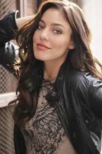
Joan: Nice job on getting the “Zorro” idea. It is quiet creative. I like the how strong your hands and arms are here. Your eyes have a great connection to the camera. I like the mask above your head but the styling is so plain. But you still look gorgeous and this is better than last round for sure.
Beth: Finally, something that I really like from you. You combined fashion with zorro. Your eyes are strong. Such a killer look here from you. I think the style is simple but gorgeous. Welcome back, Charlize
Amanda: I'm not absolutely sure if I'm feeling the "Spanish" connection here. The masquerade is more Franco-Italian. Because I first thought of "masquerade" (I look at the photo before your description), I'm not sure on the Zorro... so I don't know. Despite that, you look gorgeous, and even if I'm not sold on your selling, I love the concept. It's a gorgeous photo - not your best, but way better than the last few rounds. Good job stepping it back up
Anna: I've got to agree with Amanda here, I doubt I ever would have made the Zorro connection if you hadn't pointed it out in your description (probably because his mask is black). However, I do think this works; the color and the intensity of your eyes are great for Spain. The rope is a nice touch, and does a great job of emphasizing your best feature. Of all the models though, you seem to submit studio shots the most. This is the third week in a row where your setting has been non-existent. I am begging you, please get out of the studio and give us something a little more interesting.

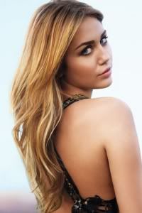
Amanda: The styling here is GORGEOUS. I really see Flamenco here - and your hair is WONDERFUL. I love the idea of this and everything works together - but there is one thing. I don't like that your eyes are closed. You almost look sad. This is supposed to be a lively dance. And your expression is far from lively, which is a pretty big issue. That aside, I really like this, so good job!
Joan: Fantastic pose and styling! You always do well at nailing those 2 things in photos. I agree with Amanda though, more energy is what this photo needs. You look dead and bored. Spain is about getting your tango or salsa on. Your styling fits perfectly for that but you drag this photo down. This entire photo needed was more energy from you and it would have been an excellent photo.
Beth: I think you are very graceful here. The pose is elegant which is what is needed for this week shoot. Beautiful dress but I do agree with the other judges. Energy!!! That's what I'm looking for in this photo. But overall, beautiful!!!
Anna: First of all, thank-you for backing off with the photoshop editing! You look incredible here; the dress, your hair, the movement. However, your expression doesn't really do justice to the rest of the image. Don't get me wrong, I think you've found a perfect angle for your face, and you really look stunning, but if you would have given us passion and intensity instead of solitude, I think everything would have come together better.

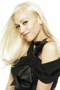
Joan: Good job you showing Spain, I love and appreciate you did research for this task. However, I am not a fan of this pose or face you have here. You look amateur and trying too hard. It is weird to see you back to this since the last two rounds you were working it. Ugh your facial expression is really ugly, it is look those hood girls in a gang or something. Just want to slap that expression right out of you and bring some fierceness to you.
Beth: I got the "Spain" vibe from the setting. Amazing setting actually. The styling is gorgeous but I'm not really convinced by your pose. I think it look weird. And the angle of your face wasn't really good too. I think you can do better than this, girl. Way better actually
Amanda: The setting is more memorable than you are. That's a problem. I'm going to remember this, but I'm not going to remember YOU. Your pose is strange. Your face is just plain bad. Your styling is just okay - it doesn't fit with the "royalty" you want to. You look like a schoolgirl wanting to be the princess. Like Joan said, that's amateurish. At this stage in the competition, we want you to DELIVER. We want a HOME RUN. This only makes first base, and that's only because of the setting. If it weren't for the setting, you'd be in huge trouble... but even with... yeah, sorry Gwen, you should be concerned :/
Anna: I'm having flashbacks from the avant garde week. In that round, you had the exact same problem as you're having now; you've nailed the theme, but you've completely forgotten about the "Gwen" part of the photo in the process. The styling is exquisite, but the combination of your pose and face simply doesn't work. I think if your face was looking straight at camera with power and intensity, the pose might not come off so cheesy. Overall, I really do like this more than I don't, but there is certainly room for improvement.

Amanda: That looks like Amsterdam to me, but the architecture IS similar to what you'd see here in Barcelona. The poodle definitely works - that's not the kind of pooch you'd see around here. I can definitely see how this is Spanish.
I'm really happy that you're not going a plasticky route this week - you aren't overdoing the makeup or anything, even if your dress is over the top. I'm more focused on that white print at the bottom than I am on you - that's a problem. I mean, you still look great, and the idea is there. The pose works. The expression is okay. There's nothing really horrible about this - at least you don't look like a Bond villain! I do kind of wish the dog was looking at us, though... but you are, so that's not a problem. Overall, this is good, but not great. Nice work
Anna: Ahhh yes, Jean Paul Gaultier's "High-Low Numero Un"...fabulous. I know Amanda thinks the dress is too over-the-top, but I am actually really glad that you decided to wear Haute Couture this week; we're in Europe now and it's definitely time to turn things up a notch. I think you've done a fantastic job researching the theme (thank-you for your in depth explanation), and your hard work has certainly payed off.
The setting is gorgeous (and even though you're actually in France, I can easily imagine this as Spain). Your dress is absolutely divine, and I think the white lace pattern adds to the Spanish vibe. There's not much to your expression or pose, but the sophisticated simplicity of it works well here. My dear Katy, I believe this is your best photograph yet, and I truly hope this is an indication that your plastic phase is officially behind you.
Joan: Love that you went with haute couture. This is the round to do it and you nailed it! I like the strong pose and your “poodle” idea for Spain. Very creative! But I am not sure about your facial expression here. Part of me thinks it is dead and dull. But the other part of me thinks it works well with this photo. Nothing more has to be said since I absolutely love and adore this photo. Good job!
Beth: Wow girl!!! Stunning. I'm so glad that we can see you did this girl. Stunning, High Fashion, Fierce!!! I like the concept. I saw spain in your photo. The explanation was really good. Single Number #1 this week? Check. Best photo this week? We will see!!! Good job, girl.

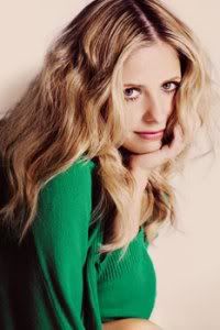
Joan: Aw you’re so cute you go with getting ready for a class for a tango dance class. I do not think this is a bad photo. Unfortunately for you Sarah when we put everyone else’s photos together, this will probably come out the most plain and dullest photo of them all. I like what you went with here since I am guessing you had a tough time finding a photo for Spain. I like your pose and how your body is turned to the camera. Not a big fan of the lighting but it works well with the setting. The dress and your hair is also cute but like I said this doesn’t leave a big impression on me sadly.
Beth: I agree with Joan. I also have some issue with the lighting. But you look beautiful here. The styling was just okay for me. I think you can do better than this. I'm not really impressed with this photo as much as I was impressed with your photos before. It's a tough week and it took lot of time and effort. Thank you for that.
Amanda: That light is just too bright. It's almost consuming you. It almost conceals your face. It surely takes the focus off of you. I'm also not seeing the Spanish connection - this photo could have been taken before pretty much any kind of dance lesson. The styling is just okay. It doesn't WOW me, especially given the lighting. I do like your hair and the idea, but again it just doesn't seem to relate to the concept. You most certainly do not look like a Flamenco dancer. They typically wear red and black because it's a COLORFUL type of dance. That's perhaps my biggest problem here - this photo is drab. There's no color. It's devoid of the emotion you want it to have. Like Joan, I really don't see myself remembering this photo after this is all said and done. Sorry Sarah, but you should be concerned this round :/
Anna: Unfortunately, I've got to agree with the other judges my dear. The styling doesn't work because it's completely wrong for the "Flamenco" (which you specifically mentioned in your description), and the lighting doesn't work because it has put your eyes into shadow (which takes away from the "fierce and sexy" look you described). I do think your pose works (even though you're killing the dress), and I like the movement in your hair. All in all, you really do look lovely, but I don't see Spain whatsoever, and that's a shame.
Welcome to Spain. Only two weeks before we crown the Winner for this cycle. Another great week for us.
Let's start our judging session

Joan: This looks like you are posing for a Spanish painter or photographer. This reminds me of the movie Vicky Christina Barcelona. I like this photo and I get the Spain vibe here. The pose, side bang, rose is wonderful. I like the dress shirt, you look very sexy. Spain girls are sexy and beautiful which is what you look like here. My only complaint is the quality is a bit off.
Beth: I got the Spain girl vibe. I think you look beautiful as always. Very flirty and sexy. I'm not a fan of the lighting here. I want more energy too. But overall, you did good again this week Ayumi
Amanda: It definitely looks like this photo has been resized. And I too don't like the lighting - this seems almost antiquated. I do see the "Spanish girl" here. The problem is that, although you're gorgeous, there's nothing unique about this. You've delivered many strong, memorable photos in this competition so far. You've built up so much steam that we expect you to deliver a strong, striking, unique photo EVERY week. This strikes me as safe. I love the styling and the concept, but there's just something that fails to make it "pop." There isn't anything majorly wrong with it, at least. It looks like old Spanish art - but it doesn't add that splash of modernity that would make it stand out from the pack. This is a strong photo, but it's just too safe for me, sorry Ayu :/
Anna: I was anxious to see what you were going to come up with this week, and I must say I am pleasantly surprised that you found something with a distinctly Spanish feel. Spain is very well known for its "passion", and you are giving it to us in spades here. I like how you're holding the single rose, and your expression is perfection. I am a little disappointed in the fashion however (I would have loved to see you in a dress here), but the man's dress shirt and setting does tell a story, so it works.

Joan: Nice job on getting the “Zorro” idea. It is quiet creative. I like the how strong your hands and arms are here. Your eyes have a great connection to the camera. I like the mask above your head but the styling is so plain. But you still look gorgeous and this is better than last round for sure.
Beth: Finally, something that I really like from you. You combined fashion with zorro. Your eyes are strong. Such a killer look here from you. I think the style is simple but gorgeous. Welcome back, Charlize
Amanda: I'm not absolutely sure if I'm feeling the "Spanish" connection here. The masquerade is more Franco-Italian. Because I first thought of "masquerade" (I look at the photo before your description), I'm not sure on the Zorro... so I don't know. Despite that, you look gorgeous, and even if I'm not sold on your selling, I love the concept. It's a gorgeous photo - not your best, but way better than the last few rounds. Good job stepping it back up

Anna: I've got to agree with Amanda here, I doubt I ever would have made the Zorro connection if you hadn't pointed it out in your description (probably because his mask is black). However, I do think this works; the color and the intensity of your eyes are great for Spain. The rope is a nice touch, and does a great job of emphasizing your best feature. Of all the models though, you seem to submit studio shots the most. This is the third week in a row where your setting has been non-existent. I am begging you, please get out of the studio and give us something a little more interesting.

Amanda: The styling here is GORGEOUS. I really see Flamenco here - and your hair is WONDERFUL. I love the idea of this and everything works together - but there is one thing. I don't like that your eyes are closed. You almost look sad. This is supposed to be a lively dance. And your expression is far from lively, which is a pretty big issue. That aside, I really like this, so good job!
Joan: Fantastic pose and styling! You always do well at nailing those 2 things in photos. I agree with Amanda though, more energy is what this photo needs. You look dead and bored. Spain is about getting your tango or salsa on. Your styling fits perfectly for that but you drag this photo down. This entire photo needed was more energy from you and it would have been an excellent photo.
Beth: I think you are very graceful here. The pose is elegant which is what is needed for this week shoot. Beautiful dress but I do agree with the other judges. Energy!!! That's what I'm looking for in this photo. But overall, beautiful!!!
Anna: First of all, thank-you for backing off with the photoshop editing! You look incredible here; the dress, your hair, the movement. However, your expression doesn't really do justice to the rest of the image. Don't get me wrong, I think you've found a perfect angle for your face, and you really look stunning, but if you would have given us passion and intensity instead of solitude, I think everything would have come together better.

Joan: Good job you showing Spain, I love and appreciate you did research for this task. However, I am not a fan of this pose or face you have here. You look amateur and trying too hard. It is weird to see you back to this since the last two rounds you were working it. Ugh your facial expression is really ugly, it is look those hood girls in a gang or something. Just want to slap that expression right out of you and bring some fierceness to you.
Beth: I got the "Spain" vibe from the setting. Amazing setting actually. The styling is gorgeous but I'm not really convinced by your pose. I think it look weird. And the angle of your face wasn't really good too. I think you can do better than this, girl. Way better actually
Amanda: The setting is more memorable than you are. That's a problem. I'm going to remember this, but I'm not going to remember YOU. Your pose is strange. Your face is just plain bad. Your styling is just okay - it doesn't fit with the "royalty" you want to. You look like a schoolgirl wanting to be the princess. Like Joan said, that's amateurish. At this stage in the competition, we want you to DELIVER. We want a HOME RUN. This only makes first base, and that's only because of the setting. If it weren't for the setting, you'd be in huge trouble... but even with... yeah, sorry Gwen, you should be concerned :/
Anna: I'm having flashbacks from the avant garde week. In that round, you had the exact same problem as you're having now; you've nailed the theme, but you've completely forgotten about the "Gwen" part of the photo in the process. The styling is exquisite, but the combination of your pose and face simply doesn't work. I think if your face was looking straight at camera with power and intensity, the pose might not come off so cheesy. Overall, I really do like this more than I don't, but there is certainly room for improvement.

Amanda: That looks like Amsterdam to me, but the architecture IS similar to what you'd see here in Barcelona. The poodle definitely works - that's not the kind of pooch you'd see around here. I can definitely see how this is Spanish.
I'm really happy that you're not going a plasticky route this week - you aren't overdoing the makeup or anything, even if your dress is over the top. I'm more focused on that white print at the bottom than I am on you - that's a problem. I mean, you still look great, and the idea is there. The pose works. The expression is okay. There's nothing really horrible about this - at least you don't look like a Bond villain! I do kind of wish the dog was looking at us, though... but you are, so that's not a problem. Overall, this is good, but not great. Nice work

Anna: Ahhh yes, Jean Paul Gaultier's "High-Low Numero Un"...fabulous. I know Amanda thinks the dress is too over-the-top, but I am actually really glad that you decided to wear Haute Couture this week; we're in Europe now and it's definitely time to turn things up a notch. I think you've done a fantastic job researching the theme (thank-you for your in depth explanation), and your hard work has certainly payed off.
The setting is gorgeous (and even though you're actually in France, I can easily imagine this as Spain). Your dress is absolutely divine, and I think the white lace pattern adds to the Spanish vibe. There's not much to your expression or pose, but the sophisticated simplicity of it works well here. My dear Katy, I believe this is your best photograph yet, and I truly hope this is an indication that your plastic phase is officially behind you.
Joan: Love that you went with haute couture. This is the round to do it and you nailed it! I like the strong pose and your “poodle” idea for Spain. Very creative! But I am not sure about your facial expression here. Part of me thinks it is dead and dull. But the other part of me thinks it works well with this photo. Nothing more has to be said since I absolutely love and adore this photo. Good job!
Beth: Wow girl!!! Stunning. I'm so glad that we can see you did this girl. Stunning, High Fashion, Fierce!!! I like the concept. I saw spain in your photo. The explanation was really good. Single Number #1 this week? Check. Best photo this week? We will see!!! Good job, girl.

Joan: Aw you’re so cute you go with getting ready for a class for a tango dance class. I do not think this is a bad photo. Unfortunately for you Sarah when we put everyone else’s photos together, this will probably come out the most plain and dullest photo of them all. I like what you went with here since I am guessing you had a tough time finding a photo for Spain. I like your pose and how your body is turned to the camera. Not a big fan of the lighting but it works well with the setting. The dress and your hair is also cute but like I said this doesn’t leave a big impression on me sadly.
Beth: I agree with Joan. I also have some issue with the lighting. But you look beautiful here. The styling was just okay for me. I think you can do better than this. I'm not really impressed with this photo as much as I was impressed with your photos before. It's a tough week and it took lot of time and effort. Thank you for that.
Amanda: That light is just too bright. It's almost consuming you. It almost conceals your face. It surely takes the focus off of you. I'm also not seeing the Spanish connection - this photo could have been taken before pretty much any kind of dance lesson. The styling is just okay. It doesn't WOW me, especially given the lighting. I do like your hair and the idea, but again it just doesn't seem to relate to the concept. You most certainly do not look like a Flamenco dancer. They typically wear red and black because it's a COLORFUL type of dance. That's perhaps my biggest problem here - this photo is drab. There's no color. It's devoid of the emotion you want it to have. Like Joan, I really don't see myself remembering this photo after this is all said and done. Sorry Sarah, but you should be concerned this round :/
Anna: Unfortunately, I've got to agree with the other judges my dear. The styling doesn't work because it's completely wrong for the "Flamenco" (which you specifically mentioned in your description), and the lighting doesn't work because it has put your eyes into shadow (which takes away from the "fierce and sexy" look you described). I do think your pose works (even though you're killing the dress), and I like the movement in your hair. All in all, you really do look lovely, but I don't see Spain whatsoever, and that's a shame.




 Sorry for the eliminated girl