Post by Bethany Joy Galeotti on Feb 28, 2012 5:50:56 GMT -5
Hello Girls!!!
Welcome to your Final Elimination before the Finale next week. This week, two girls will be eliminated and the other 3 girls will compete in the Red Carpet shoot next week..
Let's start our judging session now!!!
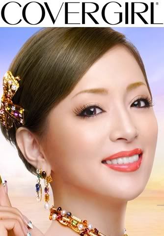
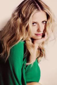
Beth: Very pretty. The color of your lipstick look very good on you. I'm not really a big fan of the styling especially the jeweleries. Too much I think. But your skin here is flawless. And it's good enough to convince people to buy the lipstick.
Amanda: I don't get your hand in the lower left corner... did you do some cropping here? That's somewhat discouraging for me - as are the jewelry. Like Beth, I think this is a bit too much for CoverGirl. We want your makeup to stand out BEFORE anything else. All the jewelry, especially the thing in your hair and the necklace to a lesser extent, combine to detract from your lips. Your skin, eyes, and lips are all great though - but I'm not so sure if this fits CoverGirl that well. We want a beauty shot here, and this really isn't it.
Anna: You are absolutely breathtaking my dear. Your skin and eyes are to die for, and I love how all of the colors pop in this photo. Your lips definitely take center stage, but I think you may have gone just a little overboard recoloring them. I'm also not a huge fan of the way the cropping has left your hand looking a little odd in the corner, but I completely understand why you had to do it. The jewelry definitely tries to steal the focus here, but honestly even with all that bling my eyes are still instantly drawn to your gorgeous face, and that's saying something!
Joan: I am going to start out with things I do not like here. Too much jewelry, it is very heavy here and if you just had 1 piece of something would have been better and lighter. And of course that random hand at the corner is distracting and when you look at the photo overall it is weird. Now I like the hair pulled up. Your face looks fresh and clean. The makeup is light and not too much. Your smile is perfect for cover girl.
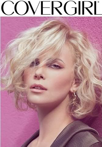
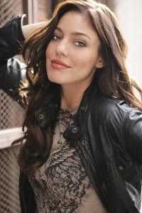
Beth: I think you picked the perfect color for this shoot. If you girls read the description for the Covergirl Outlast Lipstain "The water-based colorants of Outlast Lipstain give lips a beautiful, lightweight flush of color that won't come off, lasting for hours without the heavy look", you picked the right color. Here are the shades of color in this product
www.covergirl.com/outlastlipstain
I love your hairstyle here. I think it looks perfect on you.
Amanda: Yeah, the hair suits you. I like this, but I think the background is a bit too pink - it sort of makes your lips blend in. However, your lips and hair really do stand out on you - this is a really nice beauty shot that I could see being used for CoverGirl to promote this color of lipstick. It does what we want it to, but doesn't go beyond it - perfect for CoverGirl, really. Great work!
Anna: Oh my, look at you finally taking a risk! Your eyes are obviously your best asset, yet here you are hiding them behind your gorgeous hair...and it works. Your lips look great, and I love your expression. I do agree with Amanda that the background steals your thunder a bit, but it's not enough to really be a problem. Overall, I think you've done a fantastic job this week.
Joan: This is definitely a big risk for this photo shoot. I think you brought a sexy edge to it here. I think you did a phenomenal job and this was the time to impress us big time! Everything works well together and bravo!
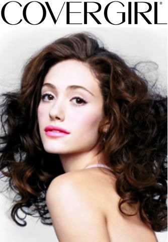
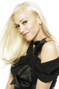
Beth: I think the posing is perfect. The styling is great but I think something went off for your photo. The lighting or quality of the photo a little bit off for me. But overall, gorgeous photo. The 'big hair' is really amazing
Amanda: Something seems a little off about this. It seems like you resized a poor-quality image, since it's blurry and almost unnatural. I love the hair - especially for CoverGirl - and your lips shine brightly. It fits for the product, but there's something that just doesn't sit right with me. It's likely the quality. Or the background being blurry. I can't completely put my finger on it.
Anna: I love the mixture of high fashion and commercial in this shot. In recent Covergirl ads, I've started noticing that they are going for this edgier look, so I think it works great here. Your lips definitely stand out, but it's pretty obvious they've been artificially recolored (if not by you then whoever you found this from). The actual quality of the image is clearly an issue (as you are well aware), but you still manage to look gorgeous...so nice job.
Joan: I like your pose and hair a lot. I think it adds a lot of personality in this cover girl picture. Now your lips do stand out but the tone is so much heavier than your eye makeup and blush where this doesn’t match up together at all. It just looks like a little girl went into her mothers makeup and put her makeup on really. Part of me likes the heavy pink and another part doesn’t. Overall this isn’t a bad picture or amazing though. It is a good photo Emmy.
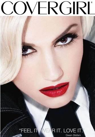
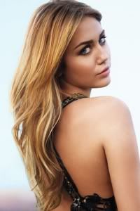
Beth: I don't think the color of your lipstick is suitable for this week shoot, since Covergirl Outlast Lipstain is focusing on Lightweight Shade but other than the color, the photo is just stunning. The angle look really good and your styling is very memorable. I love your eyes. Overall good job!!!
Amanda: This is definitely a lipstick ad and it's perfect for CoverGirl - but like Beth said, it's a bit too dark for the product this time. The lips do really stand out, and your styling and eyes are incredible. This is way better than last round - even with the issue of the text on the screen seemingly being added by a rookie. I can hardly make out the "wear" given its placement. Regardless, you look flawless here - this may be the best photo this round, but the issue with it is that it doesn't advertise the product so well. The thematic relation saved you last round... so that might mean trouble... let's hope the modelesquity value of this helps!
Anna: Now THIS is an angle that works for you! You are one of those girls that has a chin that goes on for days, so slightly leaning forward like this is definitely the way to go. Your lips are undoubtedly the focus here, so great job on that...and I must admit, I am a fan of the combination of red, black, and white. However, I wish you would have spent a minute or two finding a version of this without the text, but it's really not that big of a deal. Overall, I love the styling, I love your expression, and this is great for Covergirl (but like the others have said, the lip color doesn't quite match the product). Great job!
Joan: I like the angle a lot here, you look flawless and gorgeous. You added your own rock edge to this cover girl shoot. But I agree with the judges that the lips are too dark and heavy, when Beth said it is supposed to be lightweight so it doesn’t come out heavy like you did here. I usually don’t like to judge strictly on that since as a player it is a pain in the ass to get the exact match but when other girls follow through it is hard not to. Overall though I think this photo is wonderful and you did a good job here.
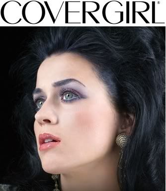
Beth: I think you also picked good color for this week shoot. I think it's a little bit of "Wild Berry" and "Saucy Plum" which is one of my favorite colors. But my issue here is the photo itself. I mean you supposed to convince people to buy your lipstick but the styling and concept for this photo is not commercial enough to attract people to buy the product.
Amanda: BRAIIIIIINS. Seriously, Katy... you look like a zombie. That's a really, really bad thing. You also have eyeshadow that stands out way more than your lipstick. Heck, are you even wearing lipstick? It almost looks like you aren't. Your mouth is kind of dry. I really don't see this as enticing for an advertisement at all. It's just... weak. And zombies don't wear makeup. Well actors playing zombies do (I'd prefer a mask myself) but that's beside the point. It may not be plasticky, but it isn't good at all. Sorry Katy, but it looks like this might be the end for you :/
Anna: Okay, let's start with what works...your lips look great and your skin is beautiful. However, everything else (including the angle, your expression, and your hair) is definitely in need of some help. I was really hoping you would come up with something spectacular this week, because after the gorgeous photo last round I thought maybe you had finally turned things around for the better, but this isn't quite what I had in mind.
Joan: Why why why why why why why why why!!!! What on earth was you think Katy? Fucking 80’s hair for cover girl? Oh my god Katy! I have been such a huge fan your last couple shoots and you disappoint me with this! They eye makeup is way too heavy and especially for a cover girl shoot. Lighter colors are always better for cover girl. The lips do have a nice color but overall that does not save this photo at all.
Welcome to your Final Elimination before the Finale next week. This week, two girls will be eliminated and the other 3 girls will compete in the Red Carpet shoot next week..
Let's start our judging session now!!!

Beth: Very pretty. The color of your lipstick look very good on you. I'm not really a big fan of the styling especially the jeweleries. Too much I think. But your skin here is flawless. And it's good enough to convince people to buy the lipstick.
Amanda: I don't get your hand in the lower left corner... did you do some cropping here? That's somewhat discouraging for me - as are the jewelry. Like Beth, I think this is a bit too much for CoverGirl. We want your makeup to stand out BEFORE anything else. All the jewelry, especially the thing in your hair and the necklace to a lesser extent, combine to detract from your lips. Your skin, eyes, and lips are all great though - but I'm not so sure if this fits CoverGirl that well. We want a beauty shot here, and this really isn't it.
Anna: You are absolutely breathtaking my dear. Your skin and eyes are to die for, and I love how all of the colors pop in this photo. Your lips definitely take center stage, but I think you may have gone just a little overboard recoloring them. I'm also not a huge fan of the way the cropping has left your hand looking a little odd in the corner, but I completely understand why you had to do it. The jewelry definitely tries to steal the focus here, but honestly even with all that bling my eyes are still instantly drawn to your gorgeous face, and that's saying something!
Joan: I am going to start out with things I do not like here. Too much jewelry, it is very heavy here and if you just had 1 piece of something would have been better and lighter. And of course that random hand at the corner is distracting and when you look at the photo overall it is weird. Now I like the hair pulled up. Your face looks fresh and clean. The makeup is light and not too much. Your smile is perfect for cover girl.

Beth: I think you picked the perfect color for this shoot. If you girls read the description for the Covergirl Outlast Lipstain "The water-based colorants of Outlast Lipstain give lips a beautiful, lightweight flush of color that won't come off, lasting for hours without the heavy look", you picked the right color. Here are the shades of color in this product
www.covergirl.com/outlastlipstain
I love your hairstyle here. I think it looks perfect on you.
Amanda: Yeah, the hair suits you. I like this, but I think the background is a bit too pink - it sort of makes your lips blend in. However, your lips and hair really do stand out on you - this is a really nice beauty shot that I could see being used for CoverGirl to promote this color of lipstick. It does what we want it to, but doesn't go beyond it - perfect for CoverGirl, really. Great work!
Anna: Oh my, look at you finally taking a risk! Your eyes are obviously your best asset, yet here you are hiding them behind your gorgeous hair...and it works. Your lips look great, and I love your expression. I do agree with Amanda that the background steals your thunder a bit, but it's not enough to really be a problem. Overall, I think you've done a fantastic job this week.
Joan: This is definitely a big risk for this photo shoot. I think you brought a sexy edge to it here. I think you did a phenomenal job and this was the time to impress us big time! Everything works well together and bravo!

Beth: I think the posing is perfect. The styling is great but I think something went off for your photo. The lighting or quality of the photo a little bit off for me. But overall, gorgeous photo. The 'big hair' is really amazing
Amanda: Something seems a little off about this. It seems like you resized a poor-quality image, since it's blurry and almost unnatural. I love the hair - especially for CoverGirl - and your lips shine brightly. It fits for the product, but there's something that just doesn't sit right with me. It's likely the quality. Or the background being blurry. I can't completely put my finger on it.
Anna: I love the mixture of high fashion and commercial in this shot. In recent Covergirl ads, I've started noticing that they are going for this edgier look, so I think it works great here. Your lips definitely stand out, but it's pretty obvious they've been artificially recolored (if not by you then whoever you found this from). The actual quality of the image is clearly an issue (as you are well aware), but you still manage to look gorgeous...so nice job.
Joan: I like your pose and hair a lot. I think it adds a lot of personality in this cover girl picture. Now your lips do stand out but the tone is so much heavier than your eye makeup and blush where this doesn’t match up together at all. It just looks like a little girl went into her mothers makeup and put her makeup on really. Part of me likes the heavy pink and another part doesn’t. Overall this isn’t a bad picture or amazing though. It is a good photo Emmy.

Beth: I don't think the color of your lipstick is suitable for this week shoot, since Covergirl Outlast Lipstain is focusing on Lightweight Shade but other than the color, the photo is just stunning. The angle look really good and your styling is very memorable. I love your eyes. Overall good job!!!
Amanda: This is definitely a lipstick ad and it's perfect for CoverGirl - but like Beth said, it's a bit too dark for the product this time. The lips do really stand out, and your styling and eyes are incredible. This is way better than last round - even with the issue of the text on the screen seemingly being added by a rookie. I can hardly make out the "wear" given its placement. Regardless, you look flawless here - this may be the best photo this round, but the issue with it is that it doesn't advertise the product so well. The thematic relation saved you last round... so that might mean trouble... let's hope the modelesquity value of this helps!

Anna: Now THIS is an angle that works for you! You are one of those girls that has a chin that goes on for days, so slightly leaning forward like this is definitely the way to go. Your lips are undoubtedly the focus here, so great job on that...and I must admit, I am a fan of the combination of red, black, and white. However, I wish you would have spent a minute or two finding a version of this without the text, but it's really not that big of a deal. Overall, I love the styling, I love your expression, and this is great for Covergirl (but like the others have said, the lip color doesn't quite match the product). Great job!
Joan: I like the angle a lot here, you look flawless and gorgeous. You added your own rock edge to this cover girl shoot. But I agree with the judges that the lips are too dark and heavy, when Beth said it is supposed to be lightweight so it doesn’t come out heavy like you did here. I usually don’t like to judge strictly on that since as a player it is a pain in the ass to get the exact match but when other girls follow through it is hard not to. Overall though I think this photo is wonderful and you did a good job here.

Beth: I think you also picked good color for this week shoot. I think it's a little bit of "Wild Berry" and "Saucy Plum" which is one of my favorite colors. But my issue here is the photo itself. I mean you supposed to convince people to buy your lipstick but the styling and concept for this photo is not commercial enough to attract people to buy the product.
Amanda: BRAIIIIIINS. Seriously, Katy... you look like a zombie. That's a really, really bad thing. You also have eyeshadow that stands out way more than your lipstick. Heck, are you even wearing lipstick? It almost looks like you aren't. Your mouth is kind of dry. I really don't see this as enticing for an advertisement at all. It's just... weak. And zombies don't wear makeup. Well actors playing zombies do (I'd prefer a mask myself) but that's beside the point. It may not be plasticky, but it isn't good at all. Sorry Katy, but it looks like this might be the end for you :/
Anna: Okay, let's start with what works...your lips look great and your skin is beautiful. However, everything else (including the angle, your expression, and your hair) is definitely in need of some help. I was really hoping you would come up with something spectacular this week, because after the gorgeous photo last round I thought maybe you had finally turned things around for the better, but this isn't quite what I had in mind.
Joan: Why why why why why why why why why!!!! What on earth was you think Katy? Fucking 80’s hair for cover girl? Oh my god Katy! I have been such a huge fan your last couple shoots and you disappoint me with this! They eye makeup is way too heavy and especially for a cover girl shoot. Lighter colors are always better for cover girl. The lips do have a nice color but overall that does not save this photo at all.

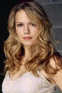
 . It's really great to have you back and you once again proved that you're such a worthy competitor. It was very tough and you should proud with your performance this cycle.
