Post by Bethany Joy Galeotti on Feb 8, 2012 21:31:57 GMT -5
Hello Girls!!!
This week only one girl will be eliminated from the competition. Let's start our judging session now!!!
Team Grey (Anne & Charlize)

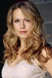
Beth: This is a combination of sexy and innocent I guess. You look great here. The way you project yourself here is good but work more on your posture. And I want you to be able to telling story from your face. It was good but I knew you can give it to us more, Anne
Anna: The color scheme and lighting in this is gorgeous. I love your pose; it's classy yet flirty. My concern is your expression; I'm not quite getting the "looks right into your heart" vibe. I see a vulnerability in you here, which really is lovely, but I think it's lacking the intensity and "sexual confidence" that your explanation describes. That aside, I think you look incredible, and you should be proud of this shot.
Amanda: I love this photo, but I don't completely see "sexy" as much as I do "innocent." I'm really glad you've brought it on HARD in these past few rounds, since this is continuing the trend of awesomeness you've delivered for us. The color is awesome. The styling is beautiful. There's no denying you're sexy, but you don't completely sell it despite how soothingly intense this photo is. That's really just a minor quibble - you and Charlize should have no problem staying this round ^_^
Joan: I like the pose. I like your dress. I like your eyes but I don’t like anything else about it. I do not know where that bright light on the right side is coming from but it is hurting my eyes. Your lips look horribly chapped. And your hair is just a mess. The only sexy I see in this photo are your eyes and you crossing your legs.

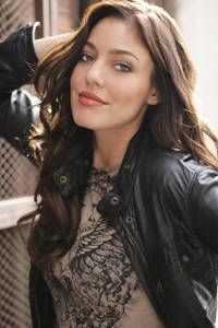
Beth: Once again, your eyes are so strong. I think your face here is very sexy. And I think you manage to make the pose sexier, without being hoochie!!! The styling is great too. Very seductive for me
Anna: The black and white works incredibly well here, and I love how the lighting is keeping the focus on your face and the seductive intensity of your eyes. The pose is rather generic, but it works because it's not clashing with your overall look, it's just not adding much either. You look stunning as always, but judging by your description, it looks like you're playing it pretty safe this week, though that doesn't change the fact that you've definitely nailed the theme.
Amanda: Yeah, this is almost too safe. There's nothing incredibly unique about it, even though the black and white works wonderfully. You're gorgeous and your eyes are fierce. The pose works well, and everything comes together nicely while still being sexy. But like Anna, I don't absolutely love it. This meets what we're looking for, but doesn't go beyond it. You'll be safe this round, especially given how epic you've been lately
Joan: You nailed it again. The black and white effect could have fucked you up royally. And it didn’t, I think it just made this photo even better. It is bold, sexy and has fashion element. Those eyes are marvelous; you look like a sexy bitch! I love this pose; once again you did a good job Charlize.
Team Pink (Katie & Miley)

Beth: Katie, I really like the concept this week and you look great. But I have problem with the quality of the photo. It looks like it was badly-cropped. I like the styling, idea and the concept but in term of the execution of it, I think you can do better with it.
Anna: You've been "hit or miss" the whole season so far, and unfortunately, I think this is another "miss". First of all, I'm not sure I understand "Sexy is relaxing." I can see that you are relaxing in this photo, but how is it defining sexiness? I think this is one of those situations where it might have helped if you went into a bit more detail in your description. I do think you look gorgeous, but I really wish there was more to it. We can't even make a connection with your expression because it's hidden by the glasses and the tiny size of the image.
Amanda: You're really not selling me much of anything here. The sunglasses don't work, since they make me turn away from your face. The only thing unique about this is your styling, which is strange for a pool. You're not showing your assets. You're just relaxing in the pool. This is almost a candid. There's nothing that strikes me about it. It's a plain, forgettable photo. I agree with Anna - this is a miss.
Joan: Hm? Let me start with what I like, the setting, the styling, and concept. Overall though it doesn’t even look like your actually modeling, like you just want to relax. The only sexy I see is your bikini, but having the sunglasses on does not help your case at all.

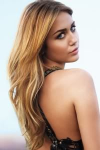
Beth: OMG, that hair again...
*Faints
I don't think that hair really suits you, Miley. That hairstyle only belongs to older woman. *Winks at Anna
But, I really like the dress. I love your phrase, Sexy is Class. The pose is great too. And I really like your face this. I can feel the emotion from your face for the first time. As for your wig

Anna: I must admit I am quite shocked that you are giving us another photo with this hairdo, especially after three judges specifically told you they did not like it (you are paying attention to the critiques, right?). As with the last shot of you with this hair style, your expression is showing me fear and sadness, which works here just about as well as it did there. Your dress is lovely, but the rings look out of place, and your pose and setting looks like it came out of any random portrait studio in the mall. I love you Miley, but I know you are capable of much better than this.
Amanda: That hair is hideous. It appears you haven't been learning anything from us, and that alone is going to hurt you considerably in the long run - if you even make it that far. I don't get the "sexy is class" especially with that ugly rag on your head. Seriously the Hannah Montana blonde would have been better than this! I'm with Beth, BURN THAT F***ING THING!
I really can't find any redeeming qualities about this, and the fact that you're throwing our feedback aside hurts you A LOT. The dress is good and it is classy, but the rings are too big. I don't see "sexy." Let you hair down! Show your assets! You're not showing us anything but ugliness. Your face is WEAK. Your hair is UGLY. The background SUCKS - like Anna, it looks like it was taken at a Sears Portrait Studio. The ONLY thing I like is the dress, so you are in a LOT of trouble this week.
Joan: LMAO! Mini Anna is back! Your face looks lost here. You look like you don’t know where you are. That is not sexy! The concept with the styling could have been sexy but it just fails. If you had your whole body laying down it would have worked so much more. If you didn’t look lost or scared and had confidences this would have been better. The styling shows confidences but you look so uncomfortable with the hair and outfit, it just brings the photo down.
Team Orange (Emmy & Sarah)

Beth: I like the setting. Very sexy and I love the styling too. I think you manage to give us the definition of sexy from your perspective. But you still can work on your face. Beside that, I don't feel the pose was natural. But I still think you did such a good job, Emmy
Anna: This is easily one of my favorite photos of the competition so far. I really do love everything about this: the fantastic use of color, the simple yet gorgeous styling, your fun and flirty expression and pose, and even the wonderful setting. Your incredibly detailed explanation was a nice read, but really unnecessary in my opinion since your photo says it all. I know Beth doesn't like that your pose isn't natural, but I think it's great that you are still "modeling" here, and not just simply laying on a towel.
Amanda: This is wonderful. It's a typical "day on the beach" photo taken to the next level. You look like a modern-day take on an old Coke ad. I could totally see them using this in a magazine. The sunglasses are a nice touch, it's flirtatious without being trashy, and it sucks me in. I really, really like this. But if it is an actual Coke ad, then...
Joan: The styling here is cute, I like how you’re not just wearing a bikini a top. From just looking at your face this photo is cute, but looking at it with your body makes this photo sexy. I don’t think anything about your face here shouts sexy. But that’s helps you out Emmy. Overall I like this Emmy and think you did a good job.

Beth: I love your hair here. Not sure about your styling. I think there's nothing special with the styling. I think this photo was too safe, Sarah. Except the wind on your hair.
Anna: I'm getting an all sorts of awkward vibe here, Sarah. I don't like the wind in your hair nearly as much as Beth does, and I think your expression isn't quite right either (it may just be the quality of the image, but it doesn't look natural to me). I suppose the styling and pose works, but it is incredibly boring. I see the "confidence" you talked about, and you really do look sexy...I just wish you would have taken this to the next level.
Amanda: I see the confidence. I see the sexy. I actually enjoy the wind in your hair, since that's done well. But that's also overdone. There's nothing unique about this. This is one that fits in with the crowd. This is not as good as what we want! It's a boring kind of sexy. And yeah, your face is weak. You almost look constipated. I don't hate it hate it, but I don't really like it. There's nothing unique about this, and that's a potential problem. A potential really big problem. Sorry :/
Joan: Looks like you’re not afraid to show us what you’re working with Sarah! I like this and then I don’t. I like the hair blowing, and pose. But your face is just blah and boring again. And that outfit is atrocious. This is just an okay photo for me. It’s not good but it’s not bad you could of done worse.
Team Purple (Katy & Troian)

Beth: The pose looks awkward, Katy. It feels like you try to smell your armpit or something. I really like the setting, Better quality of photo would help this photo a lot. There's something off with your styling. Overall, I think you can do better than this girlll..
Anna: I am loving the color blocking here, Katy. It adds energy to the shot, and I think it's great how your outfit even matches the setting around you. I think your pose could have been better, especially that right arm of yours, but it's not a total disaster. You've chosen a pretty generic description of sexiness, but it matches your photo, so it works I suppose. I can't decide if I like your makeup either; it is rather obnoxious, but it does match the overall look of the image. Overall, I think this shot fits the theme, but at this stage of the competition, you really need to make sure you're giving us the best of the best.
Amanda: I expected so much more from you, Katy. I absolutely adore the setting, but it consumes you. Only your hair stands out, and I don't know how much I like it. The pose is strange. I hate the color of your skirt since I don't think it works here. And I don't completely see how you're selling us your assets. I mean, you're Katy Perry. You are one of the most unique entertainers out there, and this theme is the one that got away. I really expected a lot more than this... sorry :/
Joan: Oh no you’re back in turning in bad pictures. The only thing I can say I like about this is the setting, overall this is photo is bad. Your 80’s hair style is not sexy, actually the whole 80’s concept this photo has is not sexy. Your face is scary not sexy, especially your head turning half way making it look like The Exorcist. I do not like this picture Katy or think this photo is sexy. You look so much more beautiful and sexy from your magazine cover, that’s what I wanted to see from you not this mess!

Beth: I think this is very sexy and haunted at the same time. I love your legs here. I'm also a fan of your emotion in this photo. I can feel the vulnerable side of you. The sadness from your eyes just come out naturally.
Anna: Unfortunately, I think "the way the light hits your body" is the worst thing about this image, let alone it being your definition of sexy. As with Beth, I see your vulnerability and sadness here, but I'm having a hard time connecting that to sexiness. You really do look gorgeous though, and the pose and styling is nice, but that's about as far as it goes. I think the problem is, it seems like every week all you give us is a "pretty girl"...I just wish you would start giving us a "Top Model".
Amanda: I'm with Anna, unfortunately for you. The light is almost blinding here and robs the photo of any sex appeal. The light doesn't just hit your body... it engulfs you. Your leg is great, but we want to see more of it! You are definitely really pretty, and your vulnerability works, but it doesn't define "sexy" here. You're not selling any assets you have. You're just being pretty. And that makes this just okay at best - we want sexy more than pretty. This isn't the best you could do, but it may be enough to keep you moving forward.
Joan: The sunlight is hitting your face not your body. I like the natural not over the top this photo has. The leg definitely helps bring sexy to the photo. The main problem this photo has is the light, if this had none of the mumbo light crap, this would have been way better. But I think this natural look you have shown sexy so good job.
Team Blue (Ayumi & Gwen)

Beth: Wow, your skin here is so flawless. I'm not sure about the angle. But I like your pose. It's a little bit hoochie but still acceptable for me. Overall, you look beautiful here.
Anna: My goodness, you are a little piece of perfection, aren't you? I think your description is wonderful, and does a great job of explaining your reason behind choosing this shot. Your expression and pose work nicely for this, and I love the little extra touch with the earrings and necklace. I do think the lighting is a bit harsh, and your hair almost looks green to me for some reason, but overall I think you've done a great job.
Amanda: This is gorgeous. Your skin is perfect. The pose is great. The styling is wonderful. It is sexy in a positive, memorable way. However, I do agree with the other gripes here - the angle of your face doesn't completely sell me, and your hair looks weird. Nothing major there, though - this is something to be proud of! It's better than last round
Joan: I was so worried; looking at those samples that you’re sexy was going to be tacky. I think you did a wonderful job; this is your best photo so far in the game. Looks like someone has been using Olay! I have nothing bad to say about this photo actually. I really like this Ayumi.

Beth: You looked high in this photo. I really like the whole styling. I agree with you that Sexy is a Powerful Woman, but in term of your face, I'm not a fan Gwen. Not sure with it. But I genuinely like your styling here. Very unique and independent.
Anna: I think you look great here Gwen, but it does seem a bit too over-the-top. I think in a different situation, your expression could really work, but when it's coupled with that pose, it's just too much. If your face gave us more of the "Powerful" emotion you used in your description, everything would have come together better. However, I do agree with Beth that the styling is lovely, and it definitely matches your definition of sexiness.
Joan: Eh! The whole gangsta outfit styling doesn’t bother me as much as that awful pose and facial expression you have. The only sexy I can see here is part of your bra showing. The styling could of worked but that pose and expression just fails. You just look tired and you are falling asleep while taking off your clothes. I don’t get this Gwen.
Amanda: I'm not sold on this. The sunglasses seem to take away more than they add, given how they hide some of your emotion and thus we don't get the "power" you want us to see. I also think two pendants are a bad idea here. Aside from that, the styling IS good, but it isn't impeccable, and this IS sexy, but almost a bit too much, especially given that the long pendant almost looks like it's censoring something. I like the idea a lot, but I'm not completely sure on the execution. It's just okay for me. :/
This week only one girl will be eliminated from the competition. Let's start our judging session now!!!
Team Grey (Anne & Charlize)
Beth: This is a combination of sexy and innocent I guess. You look great here. The way you project yourself here is good but work more on your posture. And I want you to be able to telling story from your face. It was good but I knew you can give it to us more, Anne
Anna: The color scheme and lighting in this is gorgeous. I love your pose; it's classy yet flirty. My concern is your expression; I'm not quite getting the "looks right into your heart" vibe. I see a vulnerability in you here, which really is lovely, but I think it's lacking the intensity and "sexual confidence" that your explanation describes. That aside, I think you look incredible, and you should be proud of this shot.
Amanda: I love this photo, but I don't completely see "sexy" as much as I do "innocent." I'm really glad you've brought it on HARD in these past few rounds, since this is continuing the trend of awesomeness you've delivered for us. The color is awesome. The styling is beautiful. There's no denying you're sexy, but you don't completely sell it despite how soothingly intense this photo is. That's really just a minor quibble - you and Charlize should have no problem staying this round ^_^
Joan: I like the pose. I like your dress. I like your eyes but I don’t like anything else about it. I do not know where that bright light on the right side is coming from but it is hurting my eyes. Your lips look horribly chapped. And your hair is just a mess. The only sexy I see in this photo are your eyes and you crossing your legs.

Beth: Once again, your eyes are so strong. I think your face here is very sexy. And I think you manage to make the pose sexier, without being hoochie!!! The styling is great too. Very seductive for me
Anna: The black and white works incredibly well here, and I love how the lighting is keeping the focus on your face and the seductive intensity of your eyes. The pose is rather generic, but it works because it's not clashing with your overall look, it's just not adding much either. You look stunning as always, but judging by your description, it looks like you're playing it pretty safe this week, though that doesn't change the fact that you've definitely nailed the theme.
Amanda: Yeah, this is almost too safe. There's nothing incredibly unique about it, even though the black and white works wonderfully. You're gorgeous and your eyes are fierce. The pose works well, and everything comes together nicely while still being sexy. But like Anna, I don't absolutely love it. This meets what we're looking for, but doesn't go beyond it. You'll be safe this round, especially given how epic you've been lately

Joan: You nailed it again. The black and white effect could have fucked you up royally. And it didn’t, I think it just made this photo even better. It is bold, sexy and has fashion element. Those eyes are marvelous; you look like a sexy bitch! I love this pose; once again you did a good job Charlize.
Team Pink (Katie & Miley)

Beth: Katie, I really like the concept this week and you look great. But I have problem with the quality of the photo. It looks like it was badly-cropped. I like the styling, idea and the concept but in term of the execution of it, I think you can do better with it.
Anna: You've been "hit or miss" the whole season so far, and unfortunately, I think this is another "miss". First of all, I'm not sure I understand "Sexy is relaxing." I can see that you are relaxing in this photo, but how is it defining sexiness? I think this is one of those situations where it might have helped if you went into a bit more detail in your description. I do think you look gorgeous, but I really wish there was more to it. We can't even make a connection with your expression because it's hidden by the glasses and the tiny size of the image.
Amanda: You're really not selling me much of anything here. The sunglasses don't work, since they make me turn away from your face. The only thing unique about this is your styling, which is strange for a pool. You're not showing your assets. You're just relaxing in the pool. This is almost a candid. There's nothing that strikes me about it. It's a plain, forgettable photo. I agree with Anna - this is a miss.
Joan: Hm? Let me start with what I like, the setting, the styling, and concept. Overall though it doesn’t even look like your actually modeling, like you just want to relax. The only sexy I see is your bikini, but having the sunglasses on does not help your case at all.

Beth: OMG, that hair again...
*Faints
I don't think that hair really suits you, Miley. That hairstyle only belongs to older woman. *Winks at Anna
But, I really like the dress. I love your phrase, Sexy is Class. The pose is great too. And I really like your face this. I can feel the emotion from your face for the first time. As for your wig

Anna: I must admit I am quite shocked that you are giving us another photo with this hairdo, especially after three judges specifically told you they did not like it (you are paying attention to the critiques, right?). As with the last shot of you with this hair style, your expression is showing me fear and sadness, which works here just about as well as it did there. Your dress is lovely, but the rings look out of place, and your pose and setting looks like it came out of any random portrait studio in the mall. I love you Miley, but I know you are capable of much better than this.
Amanda: That hair is hideous. It appears you haven't been learning anything from us, and that alone is going to hurt you considerably in the long run - if you even make it that far. I don't get the "sexy is class" especially with that ugly rag on your head. Seriously the Hannah Montana blonde would have been better than this! I'm with Beth, BURN THAT F***ING THING!
I really can't find any redeeming qualities about this, and the fact that you're throwing our feedback aside hurts you A LOT. The dress is good and it is classy, but the rings are too big. I don't see "sexy." Let you hair down! Show your assets! You're not showing us anything but ugliness. Your face is WEAK. Your hair is UGLY. The background SUCKS - like Anna, it looks like it was taken at a Sears Portrait Studio. The ONLY thing I like is the dress, so you are in a LOT of trouble this week.
Joan: LMAO! Mini Anna is back! Your face looks lost here. You look like you don’t know where you are. That is not sexy! The concept with the styling could have been sexy but it just fails. If you had your whole body laying down it would have worked so much more. If you didn’t look lost or scared and had confidences this would have been better. The styling shows confidences but you look so uncomfortable with the hair and outfit, it just brings the photo down.
Team Orange (Emmy & Sarah)

Beth: I like the setting. Very sexy and I love the styling too. I think you manage to give us the definition of sexy from your perspective. But you still can work on your face. Beside that, I don't feel the pose was natural. But I still think you did such a good job, Emmy
Anna: This is easily one of my favorite photos of the competition so far. I really do love everything about this: the fantastic use of color, the simple yet gorgeous styling, your fun and flirty expression and pose, and even the wonderful setting. Your incredibly detailed explanation was a nice read, but really unnecessary in my opinion since your photo says it all. I know Beth doesn't like that your pose isn't natural, but I think it's great that you are still "modeling" here, and not just simply laying on a towel.
Amanda: This is wonderful. It's a typical "day on the beach" photo taken to the next level. You look like a modern-day take on an old Coke ad. I could totally see them using this in a magazine. The sunglasses are a nice touch, it's flirtatious without being trashy, and it sucks me in. I really, really like this. But if it is an actual Coke ad, then...
Joan: The styling here is cute, I like how you’re not just wearing a bikini a top. From just looking at your face this photo is cute, but looking at it with your body makes this photo sexy. I don’t think anything about your face here shouts sexy. But that’s helps you out Emmy. Overall I like this Emmy and think you did a good job.

Beth: I love your hair here. Not sure about your styling. I think there's nothing special with the styling. I think this photo was too safe, Sarah. Except the wind on your hair.
Anna: I'm getting an all sorts of awkward vibe here, Sarah. I don't like the wind in your hair nearly as much as Beth does, and I think your expression isn't quite right either (it may just be the quality of the image, but it doesn't look natural to me). I suppose the styling and pose works, but it is incredibly boring. I see the "confidence" you talked about, and you really do look sexy...I just wish you would have taken this to the next level.
Amanda: I see the confidence. I see the sexy. I actually enjoy the wind in your hair, since that's done well. But that's also overdone. There's nothing unique about this. This is one that fits in with the crowd. This is not as good as what we want! It's a boring kind of sexy. And yeah, your face is weak. You almost look constipated. I don't hate it hate it, but I don't really like it. There's nothing unique about this, and that's a potential problem. A potential really big problem. Sorry :/
Joan: Looks like you’re not afraid to show us what you’re working with Sarah! I like this and then I don’t. I like the hair blowing, and pose. But your face is just blah and boring again. And that outfit is atrocious. This is just an okay photo for me. It’s not good but it’s not bad you could of done worse.
Team Purple (Katy & Troian)

Beth: The pose looks awkward, Katy. It feels like you try to smell your armpit or something. I really like the setting, Better quality of photo would help this photo a lot. There's something off with your styling. Overall, I think you can do better than this girlll..
Anna: I am loving the color blocking here, Katy. It adds energy to the shot, and I think it's great how your outfit even matches the setting around you. I think your pose could have been better, especially that right arm of yours, but it's not a total disaster. You've chosen a pretty generic description of sexiness, but it matches your photo, so it works I suppose. I can't decide if I like your makeup either; it is rather obnoxious, but it does match the overall look of the image. Overall, I think this shot fits the theme, but at this stage of the competition, you really need to make sure you're giving us the best of the best.
Amanda: I expected so much more from you, Katy. I absolutely adore the setting, but it consumes you. Only your hair stands out, and I don't know how much I like it. The pose is strange. I hate the color of your skirt since I don't think it works here. And I don't completely see how you're selling us your assets. I mean, you're Katy Perry. You are one of the most unique entertainers out there, and this theme is the one that got away. I really expected a lot more than this... sorry :/
Joan: Oh no you’re back in turning in bad pictures. The only thing I can say I like about this is the setting, overall this is photo is bad. Your 80’s hair style is not sexy, actually the whole 80’s concept this photo has is not sexy. Your face is scary not sexy, especially your head turning half way making it look like The Exorcist. I do not like this picture Katy or think this photo is sexy. You look so much more beautiful and sexy from your magazine cover, that’s what I wanted to see from you not this mess!

Beth: I think this is very sexy and haunted at the same time. I love your legs here. I'm also a fan of your emotion in this photo. I can feel the vulnerable side of you. The sadness from your eyes just come out naturally.
Anna: Unfortunately, I think "the way the light hits your body" is the worst thing about this image, let alone it being your definition of sexy. As with Beth, I see your vulnerability and sadness here, but I'm having a hard time connecting that to sexiness. You really do look gorgeous though, and the pose and styling is nice, but that's about as far as it goes. I think the problem is, it seems like every week all you give us is a "pretty girl"...I just wish you would start giving us a "Top Model".
Amanda: I'm with Anna, unfortunately for you. The light is almost blinding here and robs the photo of any sex appeal. The light doesn't just hit your body... it engulfs you. Your leg is great, but we want to see more of it! You are definitely really pretty, and your vulnerability works, but it doesn't define "sexy" here. You're not selling any assets you have. You're just being pretty. And that makes this just okay at best - we want sexy more than pretty. This isn't the best you could do, but it may be enough to keep you moving forward.
Joan: The sunlight is hitting your face not your body. I like the natural not over the top this photo has. The leg definitely helps bring sexy to the photo. The main problem this photo has is the light, if this had none of the mumbo light crap, this would have been way better. But I think this natural look you have shown sexy so good job.
Team Blue (Ayumi & Gwen)

Beth: Wow, your skin here is so flawless. I'm not sure about the angle. But I like your pose. It's a little bit hoochie but still acceptable for me. Overall, you look beautiful here.
Anna: My goodness, you are a little piece of perfection, aren't you? I think your description is wonderful, and does a great job of explaining your reason behind choosing this shot. Your expression and pose work nicely for this, and I love the little extra touch with the earrings and necklace. I do think the lighting is a bit harsh, and your hair almost looks green to me for some reason, but overall I think you've done a great job.
Amanda: This is gorgeous. Your skin is perfect. The pose is great. The styling is wonderful. It is sexy in a positive, memorable way. However, I do agree with the other gripes here - the angle of your face doesn't completely sell me, and your hair looks weird. Nothing major there, though - this is something to be proud of! It's better than last round

Joan: I was so worried; looking at those samples that you’re sexy was going to be tacky. I think you did a wonderful job; this is your best photo so far in the game. Looks like someone has been using Olay! I have nothing bad to say about this photo actually. I really like this Ayumi.

Beth: You looked high in this photo. I really like the whole styling. I agree with you that Sexy is a Powerful Woman, but in term of your face, I'm not a fan Gwen. Not sure with it. But I genuinely like your styling here. Very unique and independent.
Anna: I think you look great here Gwen, but it does seem a bit too over-the-top. I think in a different situation, your expression could really work, but when it's coupled with that pose, it's just too much. If your face gave us more of the "Powerful" emotion you used in your description, everything would have come together better. However, I do agree with Beth that the styling is lovely, and it definitely matches your definition of sexiness.
Joan: Eh! The whole gangsta outfit styling doesn’t bother me as much as that awful pose and facial expression you have. The only sexy I can see here is part of your bra showing. The styling could of worked but that pose and expression just fails. You just look tired and you are falling asleep while taking off your clothes. I don’t get this Gwen.
Amanda: I'm not sold on this. The sunglasses seem to take away more than they add, given how they hide some of your emotion and thus we don't get the "power" you want us to see. I also think two pendants are a bad idea here. Aside from that, the styling IS good, but it isn't impeccable, and this IS sexy, but almost a bit too much, especially given that the long pendant almost looks like it's censoring something. I like the idea a lot, but I'm not completely sure on the execution. It's just okay for me. :/

