Post by Bethany Joy Galeotti on Feb 14, 2012 22:14:14 GMT -5
Hello Girls!!!
Welcome to your Seventh Judging Session. This week we didn't really impressed with you girls but it was a tough week. Thank you for your effort, girls!!!
Let's take a look at the photos this week

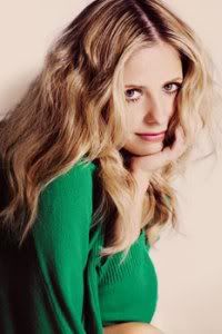
Beth: I'm sorry Anne. I didn't get the sadness in this photo. I'm not so sure about this. I found nothing's memorable about this photo. I wish the emotion from your face would be more stronger than this. I just didn't get the sadness part from this photo. . But your skin is flawless here.
Anna: Your eyes could be showing sadness I suppose, but your mouth makes it look like you're disgusted. Since your entire interpretation of the song is based on "heart break", your overall expression doesn't come together nearly as well as it should. I do like the look of this photo though, from the soft setting to your lovely dress and hair, but I still don't think it's enough to make up for the shortcomings.
Amanda: You look amazing here. The styling is impeccable, and your eyes are wonderful. I don't completely see disgust myself... but I don't see sadness either. This is just another one of those "pretty girl" shots that does nothing to stand out from the pile. It's not unique. It's beautiful, but it isn't memorably so. I don't see the connection to the song. It's still a good photo, but it's really just okay with this theme, that song (one of my favorite Whitney songs actually), and what we were expecting from you after you and Charlize had that heyday. We want to see that girl back again... just no blonde, please.
Joan: You don’t look like you have a broken heart here. It is more like you are anticipating something you may be scared or worried of. I think the styling is gorgeous and you look amazing. The picture itself is interesting, it is certainly not boring which you had last week. As for your Whitney song, you just barely pulled it off.

Amanda: There is only ONE thing I don't like about this: The angle of your face. It's really difficult to tell if it's even you. Aside from that... WOWZA. This thing is telling a story, which very much seems biblical like The Prince of Egypt (damn I really want to see that movie again now), and the setting is GORGEOUS. It's majestic. Your dress is wonderful, and the candelabra you're holding is a very creative use of prop. It's very clear to me that you're believing in yourself, hoping for that miracle, and it seems to be coming because there can be miracles / when you believe. This is the Ayu that put herself on the map in the first two rounds. I'm glad to see you back
Beth: I agree with Amanda. I think this photo reflects the song well. I can relate to the story in your photo. You look confident and strong here. One of your best photo definitely. And that dress. I'm so going to campaign for you for the Best Dress title this week.
Anna: I think your interpretation of the song is wonderful, and you look phenomenal. When reading the lyrics, it's absolutely incredible how well your photo matches the words. The setting is perfect, your dress is divine, your pose and expression are spot on, and my ONLY tiny criticism is the poor quality of the photo. You've really outdone yourself this time Ayumi, great job.
Joan: I have no complaints here. I think you are improving and improving each week. Not only did you nail the Whitney song but also give us an amazing photo. Good job!

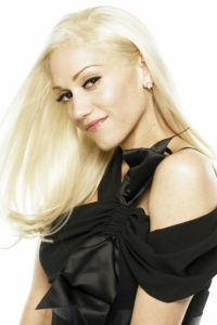
Amanda: I see all the gold, but it seems to have been added with Photoshop, and therefore I really don't get a sense of "wealth." The dress is stunning, and your pose is grand, also. Your face is a bit weak, and I'm not sold on the hair. You look a bit older. Overall, this is good - but I'm not completely sold on how it fits the song.
Beth: I saw this photo as one of your samples during Sexy week and I was like 'please don't pick this photo' and you didn't but suddenly here it comes; I didn't like it Charlize. I felt it was so unnatural. I like your face though but the overall concept just didn't work for me.
Anna: I am going to have to take a stand here and COMPLETELY disagree with the other judges. I watched Whitney's original music video for this, and it's amazing to me how WELL this photo works for "Million Dollar Bill". It's a song about how someone makes you FEEL like a million bucks, and here I think you have done a fantastic job at translating that, from your confident and sexy walk to that pitch perfect expression; even your dress looks surprisingly similar to what Whitney wore in the video. I will admit the artificial coloring of this shot doesn't do you any favors, but I certainly don't think it ruins it. When reading your extremely shallow explanation, I don't think even you realize how well everything comes together (which may have been what really put Amanda off), but when I personally look at all the individual elements, it's almost perfect in my opinion.
Joan: I actually like this concept. Very unusual, I think the pose is strong. I am not a fan of your face though. I think it falls flat. As for your Whitney song, I think you did well. Your explanation says it Million Dollar Bill is rich like Gold!

Amanda: I really like your outfit here. It's very stylish and fashionable, and you wear it really well. The lipstick also matches your shirt, and I like little things like that. I also like the angle here - we can still see your face, and we can still see that you're almost sad, waiting, thinking of someone - I can totally relate to that. I see how it relates to the song - you're definitely lost in thought, trying to be strong. Waiting is something that suffices well. I think your hair is just okay, however - but at least it isn't in the way. The biggest complaint I have, however, is the boring background. Why aren't you in the cafe where you first met? Why aren't you in a place where you might see him? Why are you in a studio? Overall, this is strong, but the lack of setting makes it lose its luster. It's not memorable, since the story isn't what it could be. Still, good job!
Beth: I'm a little bit torn for you this week. I like the styling. Definitely gorgeous. And I can feel your emotion from the body language but I wish, we can see you face more since I think it should be the main element when you're trying to portray sadness in a photo. But, as I said before, I do like your styling.
Anna: I must admit, I am rather underwhelmed by this photo. When listening to the song, Whitney is fighting to hang on to her man, unwilling to truly let him go, but I don't really see that here with you. Beth and Amanda mentioned sadness, but in my opinion this song is more about hope and never giving up: "You're still my man, nothing can change it."
I think your pose and expression are subtle and quite beautiful, I just don't really see that "fighting spirit" she portrays in the song. I agree with the other judges that the styling is lovely; and overall, I do see how this shot relates to the song, I just wish there was more to it.
Joan: You look like you have given up. I like the styling and concept. But your face is very weak here. The pose and the head down helps see sad but you’re just looking down. Yeah your grey background is boring but it makes your outfit pop out. In the lyrics it says “I’ll wait for you” which you pointed out, and I don’t see that. Like I said, you look more like you given up on the love you had rather than hoping it comes back.
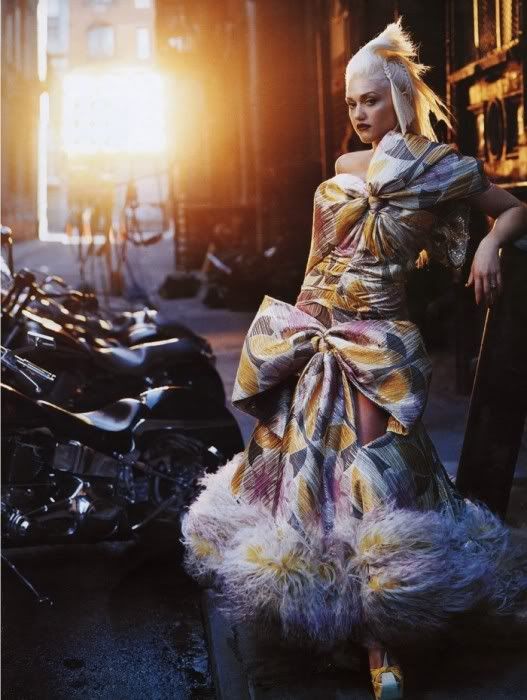
Beth: The setting here is great. I think you always nailed the setting part. You always giving us something interesting, but when it come to your face, you failed to impress me on that part. Not so sure about the styling. It's memorable but wasn't sure about it. I think the connection between the song and the photo is there.
Amanda: The connection to the song is there, but this photo isn't strong. Your face looks... how to put it... pudgy, almost masculine. I like the outfit somewhat, but find it to be a bit over-the-top when compared to Whitney's more traditional garb - this song was more than likely directed at her black supremacist critics who wanted her to be an R&B/soul singer, and she didn't want that. She wanted to do what she wanted to do, not what other people told her to do, and for that she gets a lot of respect from me. You are showing this in a very different way, and you manage to make it memorable - but not necessarily for the right reasons. I love the settings, and your outfit is... yeah. Again, your face is what kills it for me. I don't mean to be insultive, but you don't look very attractive in this picture, and I know you can do better than that. So... I'm really mixed this week, sorry :/
Anna: I understand your interpretation of the song, with the whole "I don't care what other people think" idea, but you can't forget that this is a modeling competition, and this tomboy expression and pose of yours has really drained you of your beauty. The dress also overwhelms you here, and since this song is clearly about your strength and independence, I think it would have worked better if you took control of your outfit, not the other way around (all we see is one arm and your head...if we saw both arms and more of your bare shoulder and neck, I think you would look much more powerful, but as is, you are almost completely hidden).
Joan: You’re the different and unique model left in the game. I agree with Beth on how you give us a fantastic setting and story but your face kills it. I think you understood and Whitney part of the task but the pose and face is just dull. We always look at you before the setting, think about that next time.

Amanda: This feels somewhat candid to me. Neither of you is facing the camera, and although you definitely have chemistry, it just isn't anything worth noting. Both of you are squinting your eyes and are very lost in each other - it just doesn't translate well to a camera. Your outfit is decent, the concept is strong, the setting works and feels like you're about to make out at a well-lit park at night, and I can definitely feel the relation to the song, but is it too much to ask for more? I see the chemistry, but I don't see the "modeling" aspect here. This is sort of like a Facebook pic. Not completely, but almost. I want to like it, but I really don't know how much I do :/
Beth: I don't think the angle is great for you, Katy. I think this photo does reflect the song well but the angle just didn't work out. Your styling is quite great. I think this photo have the potential because I do like the styling and the concept. I think you can lot better than this Katy
Anna: Katy, I am so happy to see you're finally listening to our critiques! For the past few weeks, we have been complaining about how unnatural and posey you look, but this time you have given us a very natural and beautiful shot, and for that I am grateful. I see a clear connection to the song here, but I do think it's lacking energy; "I'm Your Baby Tonight" is full of bubbly excitement (Whitney can't even help dancing around throughout most of the video), but here you are showing us a quietly romantic moment in the grass. Like Amanda, I do think this definitely has a candid or "movie still" quality to it, but I still think you look lovely, and I do feel the connection between you and your man; which is what this is all about.
Joan: Exactly! I am so happy you don’t look plastic here! This is the Katy I like! I like the styling and concept. It fits the Whitney song well. However I agree about the angle, this angle benefits the male more than you. But I am just so happy you listened and brought us a natural photo. Good job!

Amanda: I'm reading your expression. You're saying "He's going to kiss me!" and you're really excited. He IS focused on you, and you ARE showing us your face - which is great. Your smile has a lot of energy, even if the angle of it is a bit awkward. He really, really likes you, and he's happy to be with you, which is great. What isn't great is that this is a blank white background - the only instance of a setting is that stool you're standing on because you're really short. That sort of robs this photo of its intimacy, and overwhelms your smile. That's only a minor quibble really - this is still a good shot, so good work
Beth: Miley, I really want to like this photo but I just can't. The expression on your face just didn't work for me. I don't think the dress fits you well. The setting didn't help much either. But I totally get the connection between your photo and the song.
Anna: Congratulations Miley, you've managed to disappoint me even more than you did during Sexy week. This Whitney Houston song OOZES romance ("And in the morning when I kiss his eyes...He holds me close and won't let go"), but there is not one single thing about this shot that portrays this. Your expression is extremely cheesy and fake, you look almost chubby in that dress, and you should have worn heels instead of standing on a box to make up for your lack of height. I'm trying to find something I like about this shot, but I'm having a hard time coming up with anything. I suppose you have managed to keep the focus on you rather than the man taking the spotlight, but in this case, maybe you should have let him.
Joan: I get the concept here but eh. Liam looks more genuine and almost makes me think the song is “All the women I need” and the he is the model and not you. The photo overall is just boring, there is no sparkle or anything special about it. I think the lack of setting really hurts you because if it were at a beach or even a house this would have been better and not been as boring.

Beth: I just can't help but notice the similarity between the photo this and last week. I didn't really like the photo. I think last week your pose look so gracefully but this week, it's a little bit off and stiff. I like the concept. And the connection between your photo and song is there. Your styling was okay but I do think you can better than this
Amanda: Yeah... it's like you redid last week's photo here. You don't really look lost in thought. You don't really look as special as you did last week. The idea is good and it does relate to the song, but that connection isn't as strong as it could be. The blue is also a bit much and could be toned down a little in Photoshop. This is good in a few departments, but just plain in others. I don't really see much of anything memorable about this as compared to last time. Sorry :/
Anna: My goodness, talk about déjà vu. You are stunning here Sarah; your expression and pose are wonderful (though somewhat familiar), and I absolutely love your dress and shoes. I think this shot certainly relates well to the song, and I enjoyed your well thought out explanation as well. This is one of those photos that I would have to consider "safe", but I can't deny that it works.
Joan: You nailed it! Is that a letter from your lover and you just couldn’t help but think of him? I think the styling and concept is gorgeous. My only complaint would be the shoes but that doesn’t matter since this photo not only nails the Whitney task but a wonderful photo.

Beth: The setting and the concept was good but once again the execution just didn't work for me. If your face looks straight to the camera, it would be better, girl. The styling was average for me. I think you body language can be more graceful than this.
Amanda: I really love this in a way - the setting is wonderful, and definitely issues a degree of loneliness. The styling is great (especially the hat! ), and I can definitely see that you're alone here. The pose works, and you do seem to have had fun with this shoot despite your lonely expression.
However, there are two really apparent problems here. One, the shadowing. A shadow is being cast over your body, and that makes it hard to see you. This does add to the effect of loneliness and wanting to break out of it, but it takes away more than it adds, especially given the second problem: there's no focal point here. You're not the center of attention. You're not drawing us - or a potential lover - in. The idea is wonderful, the styling is great... but it just lacks that punch that sucks you in and makes you remember it. It's good, but those two problems are pretty big ones. :/
Anna: I really like your interpretation of the song here, Troian. Finally you are giving us some energy and movement (and you are actually "modeling" for a change), but honestly, this could be anyone. I barely see your face, and like Amanda said, the shadow is hiding you. As far as your pose, I think from the waist up you look fantastic, but I don't really like your legs. The styling is simple yet unique, but doesn't add much to the story you're telling. I do like the setting, but you almost seem to get lost in it. I know there are a lot of "buts" in this critique, BUT I really do like this more than I don't.
Joan: Interesting and unexpected is what this photo is. What bothers me the most is how we can barely see your face and that shadow just makes it even harder! I love what you did here though; I always love unique and different stuff. I agree with Beth you can be more graceful. I think you took a big risk here and I don’t think it paid off a lot but it certainly won’t hurt you a lot either.
Welcome to your Seventh Judging Session. This week we didn't really impressed with you girls but it was a tough week. Thank you for your effort, girls!!!
Let's take a look at the photos this week

Beth: I'm sorry Anne. I didn't get the sadness in this photo. I'm not so sure about this. I found nothing's memorable about this photo. I wish the emotion from your face would be more stronger than this. I just didn't get the sadness part from this photo.
 . But your skin is flawless here.
 Anna: Your eyes could be showing sadness I suppose, but your mouth makes it look like you're disgusted. Since your entire interpretation of the song is based on "heart break", your overall expression doesn't come together nearly as well as it should. I do like the look of this photo though, from the soft setting to your lovely dress and hair, but I still don't think it's enough to make up for the shortcomings.
Amanda: You look amazing here. The styling is impeccable, and your eyes are wonderful. I don't completely see disgust myself... but I don't see sadness either. This is just another one of those "pretty girl" shots that does nothing to stand out from the pile. It's not unique. It's beautiful, but it isn't memorably so. I don't see the connection to the song. It's still a good photo, but it's really just okay with this theme, that song (one of my favorite Whitney songs actually), and what we were expecting from you after you and Charlize had that heyday. We want to see that girl back again... just no blonde, please.
Joan: You don’t look like you have a broken heart here. It is more like you are anticipating something you may be scared or worried of. I think the styling is gorgeous and you look amazing. The picture itself is interesting, it is certainly not boring which you had last week. As for your Whitney song, you just barely pulled it off.

Amanda: There is only ONE thing I don't like about this: The angle of your face. It's really difficult to tell if it's even you. Aside from that... WOWZA. This thing is telling a story, which very much seems biblical like The Prince of Egypt (damn I really want to see that movie again now), and the setting is GORGEOUS. It's majestic. Your dress is wonderful, and the candelabra you're holding is a very creative use of prop. It's very clear to me that you're believing in yourself, hoping for that miracle, and it seems to be coming because there can be miracles / when you believe. This is the Ayu that put herself on the map in the first two rounds. I'm glad to see you back

Beth: I agree with Amanda. I think this photo reflects the song well. I can relate to the story in your photo. You look confident and strong here. One of your best photo definitely. And that dress. I'm so going to campaign for you for the Best Dress title this week.
Anna: I think your interpretation of the song is wonderful, and you look phenomenal. When reading the lyrics, it's absolutely incredible how well your photo matches the words. The setting is perfect, your dress is divine, your pose and expression are spot on, and my ONLY tiny criticism is the poor quality of the photo. You've really outdone yourself this time Ayumi, great job.
Joan: I have no complaints here. I think you are improving and improving each week. Not only did you nail the Whitney song but also give us an amazing photo. Good job!

Amanda: I see all the gold, but it seems to have been added with Photoshop, and therefore I really don't get a sense of "wealth." The dress is stunning, and your pose is grand, also. Your face is a bit weak, and I'm not sold on the hair. You look a bit older. Overall, this is good - but I'm not completely sold on how it fits the song.
Beth: I saw this photo as one of your samples during Sexy week and I was like 'please don't pick this photo' and you didn't but suddenly here it comes; I didn't like it Charlize. I felt it was so unnatural. I like your face though but the overall concept just didn't work for me.
Anna: I am going to have to take a stand here and COMPLETELY disagree with the other judges. I watched Whitney's original music video for this, and it's amazing to me how WELL this photo works for "Million Dollar Bill". It's a song about how someone makes you FEEL like a million bucks, and here I think you have done a fantastic job at translating that, from your confident and sexy walk to that pitch perfect expression; even your dress looks surprisingly similar to what Whitney wore in the video. I will admit the artificial coloring of this shot doesn't do you any favors, but I certainly don't think it ruins it. When reading your extremely shallow explanation, I don't think even you realize how well everything comes together (which may have been what really put Amanda off), but when I personally look at all the individual elements, it's almost perfect in my opinion.
Joan: I actually like this concept. Very unusual, I think the pose is strong. I am not a fan of your face though. I think it falls flat. As for your Whitney song, I think you did well. Your explanation says it Million Dollar Bill is rich like Gold!

Amanda: I really like your outfit here. It's very stylish and fashionable, and you wear it really well. The lipstick also matches your shirt, and I like little things like that. I also like the angle here - we can still see your face, and we can still see that you're almost sad, waiting, thinking of someone - I can totally relate to that. I see how it relates to the song - you're definitely lost in thought, trying to be strong. Waiting is something that suffices well. I think your hair is just okay, however - but at least it isn't in the way. The biggest complaint I have, however, is the boring background. Why aren't you in the cafe where you first met? Why aren't you in a place where you might see him? Why are you in a studio? Overall, this is strong, but the lack of setting makes it lose its luster. It's not memorable, since the story isn't what it could be. Still, good job!
Beth: I'm a little bit torn for you this week. I like the styling. Definitely gorgeous. And I can feel your emotion from the body language but I wish, we can see you face more since I think it should be the main element when you're trying to portray sadness in a photo. But, as I said before, I do like your styling.
Anna: I must admit, I am rather underwhelmed by this photo. When listening to the song, Whitney is fighting to hang on to her man, unwilling to truly let him go, but I don't really see that here with you. Beth and Amanda mentioned sadness, but in my opinion this song is more about hope and never giving up: "You're still my man, nothing can change it."
I think your pose and expression are subtle and quite beautiful, I just don't really see that "fighting spirit" she portrays in the song. I agree with the other judges that the styling is lovely; and overall, I do see how this shot relates to the song, I just wish there was more to it.
Joan: You look like you have given up. I like the styling and concept. But your face is very weak here. The pose and the head down helps see sad but you’re just looking down. Yeah your grey background is boring but it makes your outfit pop out. In the lyrics it says “I’ll wait for you” which you pointed out, and I don’t see that. Like I said, you look more like you given up on the love you had rather than hoping it comes back.

Beth: The setting here is great. I think you always nailed the setting part. You always giving us something interesting, but when it come to your face, you failed to impress me on that part. Not so sure about the styling. It's memorable but wasn't sure about it. I think the connection between the song and the photo is there.
Amanda: The connection to the song is there, but this photo isn't strong. Your face looks... how to put it... pudgy, almost masculine. I like the outfit somewhat, but find it to be a bit over-the-top when compared to Whitney's more traditional garb - this song was more than likely directed at her black supremacist critics who wanted her to be an R&B/soul singer, and she didn't want that. She wanted to do what she wanted to do, not what other people told her to do, and for that she gets a lot of respect from me. You are showing this in a very different way, and you manage to make it memorable - but not necessarily for the right reasons. I love the settings, and your outfit is... yeah. Again, your face is what kills it for me. I don't mean to be insultive, but you don't look very attractive in this picture, and I know you can do better than that. So... I'm really mixed this week, sorry :/
Anna: I understand your interpretation of the song, with the whole "I don't care what other people think" idea, but you can't forget that this is a modeling competition, and this tomboy expression and pose of yours has really drained you of your beauty. The dress also overwhelms you here, and since this song is clearly about your strength and independence, I think it would have worked better if you took control of your outfit, not the other way around (all we see is one arm and your head...if we saw both arms and more of your bare shoulder and neck, I think you would look much more powerful, but as is, you are almost completely hidden).
Joan: You’re the different and unique model left in the game. I agree with Beth on how you give us a fantastic setting and story but your face kills it. I think you understood and Whitney part of the task but the pose and face is just dull. We always look at you before the setting, think about that next time.

Amanda: This feels somewhat candid to me. Neither of you is facing the camera, and although you definitely have chemistry, it just isn't anything worth noting. Both of you are squinting your eyes and are very lost in each other - it just doesn't translate well to a camera. Your outfit is decent, the concept is strong, the setting works and feels like you're about to make out at a well-lit park at night, and I can definitely feel the relation to the song, but is it too much to ask for more? I see the chemistry, but I don't see the "modeling" aspect here. This is sort of like a Facebook pic. Not completely, but almost. I want to like it, but I really don't know how much I do :/
Beth: I don't think the angle is great for you, Katy. I think this photo does reflect the song well but the angle just didn't work out. Your styling is quite great. I think this photo have the potential because I do like the styling and the concept. I think you can lot better than this Katy
Anna: Katy, I am so happy to see you're finally listening to our critiques! For the past few weeks, we have been complaining about how unnatural and posey you look, but this time you have given us a very natural and beautiful shot, and for that I am grateful. I see a clear connection to the song here, but I do think it's lacking energy; "I'm Your Baby Tonight" is full of bubbly excitement (Whitney can't even help dancing around throughout most of the video), but here you are showing us a quietly romantic moment in the grass. Like Amanda, I do think this definitely has a candid or "movie still" quality to it, but I still think you look lovely, and I do feel the connection between you and your man; which is what this is all about.
Joan: Exactly! I am so happy you don’t look plastic here! This is the Katy I like! I like the styling and concept. It fits the Whitney song well. However I agree about the angle, this angle benefits the male more than you. But I am just so happy you listened and brought us a natural photo. Good job!

Amanda: I'm reading your expression. You're saying "He's going to kiss me!" and you're really excited. He IS focused on you, and you ARE showing us your face - which is great. Your smile has a lot of energy, even if the angle of it is a bit awkward. He really, really likes you, and he's happy to be with you, which is great. What isn't great is that this is a blank white background - the only instance of a setting is that stool you're standing on because you're really short. That sort of robs this photo of its intimacy, and overwhelms your smile. That's only a minor quibble really - this is still a good shot, so good work

Beth: Miley, I really want to like this photo but I just can't. The expression on your face just didn't work for me. I don't think the dress fits you well. The setting didn't help much either. But I totally get the connection between your photo and the song.
Anna: Congratulations Miley, you've managed to disappoint me even more than you did during Sexy week. This Whitney Houston song OOZES romance ("And in the morning when I kiss his eyes...He holds me close and won't let go"), but there is not one single thing about this shot that portrays this. Your expression is extremely cheesy and fake, you look almost chubby in that dress, and you should have worn heels instead of standing on a box to make up for your lack of height. I'm trying to find something I like about this shot, but I'm having a hard time coming up with anything. I suppose you have managed to keep the focus on you rather than the man taking the spotlight, but in this case, maybe you should have let him.
Joan: I get the concept here but eh. Liam looks more genuine and almost makes me think the song is “All the women I need” and the he is the model and not you. The photo overall is just boring, there is no sparkle or anything special about it. I think the lack of setting really hurts you because if it were at a beach or even a house this would have been better and not been as boring.

Beth: I just can't help but notice the similarity between the photo this and last week. I didn't really like the photo. I think last week your pose look so gracefully but this week, it's a little bit off and stiff. I like the concept. And the connection between your photo and song is there. Your styling was okay but I do think you can better than this
Amanda: Yeah... it's like you redid last week's photo here. You don't really look lost in thought. You don't really look as special as you did last week. The idea is good and it does relate to the song, but that connection isn't as strong as it could be. The blue is also a bit much and could be toned down a little in Photoshop. This is good in a few departments, but just plain in others. I don't really see much of anything memorable about this as compared to last time. Sorry :/
Anna: My goodness, talk about déjà vu. You are stunning here Sarah; your expression and pose are wonderful (though somewhat familiar), and I absolutely love your dress and shoes. I think this shot certainly relates well to the song, and I enjoyed your well thought out explanation as well. This is one of those photos that I would have to consider "safe", but I can't deny that it works.
Joan: You nailed it! Is that a letter from your lover and you just couldn’t help but think of him? I think the styling and concept is gorgeous. My only complaint would be the shoes but that doesn’t matter since this photo not only nails the Whitney task but a wonderful photo.

Beth: The setting and the concept was good but once again the execution just didn't work for me. If your face looks straight to the camera, it would be better, girl. The styling was average for me. I think you body language can be more graceful than this.
Amanda: I really love this in a way - the setting is wonderful, and definitely issues a degree of loneliness. The styling is great (especially the hat!
 ), and I can definitely see that you're alone here. The pose works, and you do seem to have had fun with this shoot despite your lonely expression.
However, there are two really apparent problems here. One, the shadowing. A shadow is being cast over your body, and that makes it hard to see you. This does add to the effect of loneliness and wanting to break out of it, but it takes away more than it adds, especially given the second problem: there's no focal point here. You're not the center of attention. You're not drawing us - or a potential lover - in. The idea is wonderful, the styling is great... but it just lacks that punch that sucks you in and makes you remember it. It's good, but those two problems are pretty big ones. :/
Anna: I really like your interpretation of the song here, Troian. Finally you are giving us some energy and movement (and you are actually "modeling" for a change), but honestly, this could be anyone. I barely see your face, and like Amanda said, the shadow is hiding you. As far as your pose, I think from the waist up you look fantastic, but I don't really like your legs. The styling is simple yet unique, but doesn't add much to the story you're telling. I do like the setting, but you almost seem to get lost in it. I know there are a lot of "buts" in this critique, BUT I really do like this more than I don't.
Joan: Interesting and unexpected is what this photo is. What bothers me the most is how we can barely see your face and that shadow just makes it even harder! I love what you did here though; I always love unique and different stuff. I agree with Beth you can be more graceful. I think you took a big risk here and I don’t think it paid off a lot but it certainly won’t hurt you a lot either.

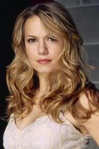
 I really hope that you can stay girl, unfortunately it was a freaking hard not just for me but to the other judges too. We considered so many things on who should stay. But at the end, today just wasn't your day, girl. Good to have you here. You're amazing. *Hugs Miley