Post by Bethany Joy Galeotti on Feb 19, 2012 4:07:23 GMT -5
Hello Girls!!!
Welcome to your Eighth Judging Session!!!. One of the toughest week definitely but I think everyone gave their best efforts in order to survive this week.
Let's start our judging session for this week

Beth: Compared to last two photos, I like this one. I like your face here. I think it's sensual and your mouth looks sexy in this photo. You worked those dress or paper bag.. Overall, I think you improved from last two weeks
Anna: Well, I'm certainly glad to see you are able to pat your head and rub your tummy at the same time. I really like the "homeless chic" look you've got here. The paper bag is creative and oddly beautiful, your hair matches the whole vagabond vibe, and yet the belt and other accessories give the whole thing an edge which is fantastic. I am happy you found this photo, but I wish you would have looked for a version that didn't have that tacky text (it took me about two minutes to find one: here).
Amanda: The text is a distraction, yes, and this image is also a bit too large to see in its entirety at once; Anna's link is much better in all departments. I like the looks you're giving us here, and this is a very unique take on what I presume to be avant-garde - a paper dress. Despite the quality issues I have, it's a very strong, striking photo, and I do like it. It just doesn't wow me, and I want to be wowed. This is still good, but it doesn't do as much for me as it could.
Joan: This is very usual. You don’t see anyone wearing a paper bag every day. I also hate having to scroll down to see the whole picture, the size is way too huge. It makes the photo have a bad quality and with the text, it makes me think this is a magazine scan. Overall though this picture is still boring, the black and white did not help not make this boring either. I like that you’re wearing the paper bag but that’s it. Nothing is “wow” or “interesting”. It is just blah.

Beth: I like your photo. Another stronger photo from you. The pose is very graceful and the Kimono looks good on you. The painting in the background also help to make this photo stand out more. I think we can see the 'Avant-Garde' element in your makeup and styling. The kimono for me is just beautiful. Nothing experimental from the outfit. Overall, good job
Anna: Oh my, the creepy fingernails are back. You look stunning here, Ayumi. Your face is flawless, your pose is artistic and graceful, and your styling has the wonderful contrast of traditional beauty with a modern twist. I also think it's clever how you've cropped this image to hide the fact that you're actually kneeling. Usually I'm not a big fan of painted screens as a backdrop, but since this is all about artistic expression, I think it works. Overall, I love the concept, and you have once again executed it beautifully.
Amanda: I like this. Not to sound cheesy, but it's very Japanesey. I love the background, since that's true to Japanese art, and you mix tradition with modernity. I'm not totally sold on the angle of your face, however, and that could be a bit of a problem - I'm really not sure what to make of your makeup. I love the kimono, though, but I'm not sold on the fingernails - this may sound cheesy, but that's a little Halloweeny. Overall, though, I do like this - just not as much as last round. Great work still!
Joan: The pose is strong, your face is focused. I think it is another good week for you Ayumi. There is really not much to say when I like a photo. The photo is gorgeous and you understood the task so good job.

Beth: The dress itself is definitely experimental but overall photo was just safe for me. From the bland setting and you style, it just failed to make me excited with this photo.
Anna: Let me expand on what Beth said, because I completely agree with her. The Galliano skirt and jacket definitely fall into the avant-garde category, but it almost looks like you are doing everything in your power to suck the life out of it. First, your hair, make-up, and expression (though stunning) doesn't at all compliment the look of the outfit. As far as your pose, I think it's strange how your jacket is framing your boob; it's a little awkward to be honest. I also couldn't help but notice you've managed to find a version of this photo that is not only of horrible quality, but it has also cropped out your fantastic shoes! Here are two examples of this outfit; one is avant-garde, the other is avant-average (pay careful attention to the make-up and accessories):
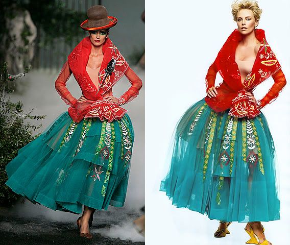
Amanda: Yeah, very safe. What happened to the Charlize that nailed three themes in a row? I want to see her again. I was expecting a lot more of you this week - given the "Evil Queen" photo you gave us. That was more avant-garde than this. It doesn't all go together, and your skirt is ugly - possibly due to the quality. The blank white background does you no favors, and I'm not going to remember this one like I am your two best photos. Sorry :/
Joan: This is differently different and what someone does not wear every day. But I agree with the other judges, this photo just falls flat. I like the outfit and I appreciate you giving us a pose but it is not working. The face is dull, and so is the background. Nice try though!

Beth: For me this is STUNNING.. I love the dress on you, I like the whole styling. And your body language here is strong. Even though, you're laying on the floor here, the angle is really good. Good job, Emmy!!!
Anna: Emmy, you look absolutely exquisite; your face is divine, and you have found a pose that is not only interesting, but it features the fashion wonderfully. However, this is the second time I think you may have gone overboard with the photoshopping. I really do appreciate how much effort you've put into this, but sticking that hat on your head was unnecessary, and it is obvious it was an artificial addition (despite your incredible photo-edit skills). Overall, I think this is a fantastic photo for the theme, I just wish you didn't feel the need to fix something that isn't broken.
Amanda: Coming from the hat expert here, yeah, I can tell something's off about yours. It looks unnatural, especially with your hair like it is. But really, that's my only quibble - it otherwise looks gorgeous, and I really can't tell that you did much of any Photoshopping work anywhere else. It's stunning, it suits the theme, and it looks great. And it's very clear that you're giving this your all, and that's what we want - good work, and keep up the awesome
Joan: Hands down one of your best photos! Everything about this I absolutely love! From the pose, styling, makeup, concept. Not only did you nail this task but you managed to still look like a model and look beautiful. Fantastic job Emmy!
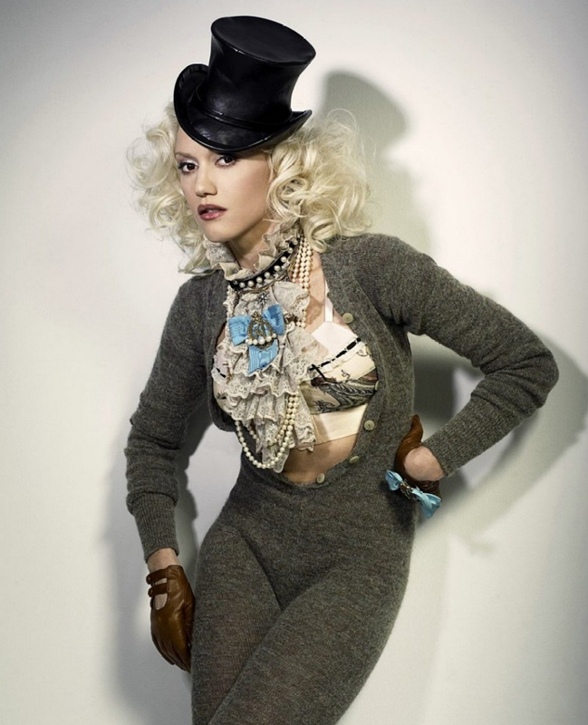
Beth: I love the combination of the jumpsuit with the top full with the beautiful accessories. The hat made this photo more interesting. And I like your post this week. The shadow help this photo since i'm not a big fan of plain studio shoot. Overall, I like your photo this week, Gwen
Anna: Okay, I hate that jumpsuit with every fiber of my being, but I am open-minded enough to realize that it clearly fits the theme, so great job on that. I adore your hair and expression, and your pose adds to the intentionally awkward nature of this shot. I love all of your accessories, from your gloves and necklaces, to the fantastic top hat. I really would have liked to see some more color here, because it seems that you are just teasing us with the little touches of blue, but I can't deny that this challenges conventions, which is the whole point of avant-garde. I knew this could be a great week for you, and you have not let me down; great job Gwen.
Amanda: You know me. I love hats. Yours is contributing a lot here - it's taking the focus off of that awful wool jumpsuit. I do see how it fits this very obscure theme, which was really tailored to you, and the accessorizing more than makes up for it. I do like how the colors stand out, but they could pop even more if there was a setting, something going on. Like Beth, I think plain studio shoots are NOT the way to go this round. They're dull. The shadow helps. The hair helps. The expression helps. The jumpsuit... doesn't. I'm willing to look past that thing, and congratulate you on a job well done
Joan: I think this task was perfect for you. Your style already is weird and usual. I like the cardigan/jumpsuit. I think this is your best photo ever in the competition; it is a huge step up from your past photos. Well done!

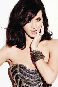
Beth: GORGEOUS!!! I love your hairstyle here. And your outfit is provocative and artistic at the same time. And the shoes!!!! *Faint!!! I think you did great girl this week!!! Bravo!!!
Anna: Oh dear, the plastic-posey Katy is back. As far as the theme, you have nailed it; your hair is intriguing, I love the vintage (yet futuristic?) lingerie, and the tattoos work incredibly well to give this an artistic edge. I'm not a huge fan of the pin-up pose, but it adds a cheekiness to the shot which is an interesting touch.
Amanda: I really don't like this, and that's really only due to the theme. I've always hated tattoos. I've always hated unnatural hair colors. I've always hated hair accessories that aren't hats (I love hats!). I've always hated "jumping" poses. I've always hated things that were "trashy." This manages to take every single thing I've had recurring quibbles about in my four and a half seasons of judging and roll it all into one... while being true to the theme. You have no idea what is going through my mind right now. I have no idea how to explain it. This is unique, this is avant-garde, and this is... so not Amanda's thing to keep rambling about. I know why I had trouble judging this theme... this stuff >_>
Joan: I actually think the plastic posey Katy works for this theme, so I do not have a big issue with that. I think this photo is very fun! It catches my attention right away and if this were an ad on a magazine I would keep looking at this photo. I agree with Beth here, I think you did a good job Katy!

Beth: I'm not sure with your photo this week, Sarah.. I didn't connect with your face this week. And the dress was just too safe and 'normal' for Avant Garde. I like the chair, though..
Anna: This is the third week in a row you're laying down...have you broken your leg or something my dear? My favorite thing about this photo is the broken chair, I think it's fascinating, and it really makes me want to know the story behind it. You, however, are rather lackluster I'm afraid. The dress is boring (considering the theme), and your expression (soft and lovely as it is) and slicked back hair aren't adding anything either. I do think that black and white can work well for avant-garde, but in this case, it only emphasizes the simplicity and vapid nature of the shot.
Amanda: I like this. I don't love it, but I can see the art and innocence here. It just isn't over-the-top enough for avant-garde. This photo intrigues me a LOT - I too want to know the story behind it. I really love your expression, and the hair sort of works and makes me even more curious, but again, that's not totally avant-garde from how I'm being forced to see it. Despite that, this is a beautiful photo, and you'll get points from me for that alone
Joan: This isn’t so bad, I like the dress. The broken chair adds something different about this photo. I think the pose is alright but like Anna said this is the third time in a row we see you lying down. Change it up a bit but don’t forget to produce a good photo as well. I think overall you did good but not amazing.

Beth: The concept is unique. But I wish we could see more. The outfit, styling and other elements in your photo!!! It's too moody and gloomy, Troian. I like those lighting though..
Anna: I'm trying to figure out if you simply can't tell when lighting is horrendous in a shot, or if you just don't care, but this really is god awful. Because of the lighting and quality of the image, most of you looks like a blob, but at least your beautiful face manages to shine through the mess I suppose. I know the photograph itself could be considered artistic and challenging conventions...but this is not a photography competition, this is a MODELING competition, and for the second week in a row, I can barely see you.
Amanda: Sorry Troi, but this is the end of the road for you. I love the lighting tube and how it adds something... but I really can't figure out what that something is due to the atrocious quality of this. I can't see your clothes well, but they look like an everyday outfit. This is an artistic idea, but it's just the lighting. You add nothing. The quality is such a big issue here... sorry :/
Joan: I am in the middle with this photo. I hate how we don’t get any fashion in this photo, and by the looks of it, it looks like you’re wearing a tank and shorts. I like your pose and facial expression but this photo shoot was the opposite of looking like a plain Jane and you managed to look like a plain Jane. The usual thing in this photo is the lights and yeah the quality is not it’s best but I think it is what makes this photo usual however it does not complement you though.
Welcome to your Eighth Judging Session!!!. One of the toughest week definitely but I think everyone gave their best efforts in order to survive this week.
Let's start our judging session for this week

Beth: Compared to last two photos, I like this one. I like your face here. I think it's sensual and your mouth looks sexy in this photo. You worked those dress or paper bag.. Overall, I think you improved from last two weeks
Anna: Well, I'm certainly glad to see you are able to pat your head and rub your tummy at the same time. I really like the "homeless chic" look you've got here. The paper bag is creative and oddly beautiful, your hair matches the whole vagabond vibe, and yet the belt and other accessories give the whole thing an edge which is fantastic. I am happy you found this photo, but I wish you would have looked for a version that didn't have that tacky text (it took me about two minutes to find one: here).
Amanda: The text is a distraction, yes, and this image is also a bit too large to see in its entirety at once; Anna's link is much better in all departments. I like the looks you're giving us here, and this is a very unique take on what I presume to be avant-garde - a paper dress. Despite the quality issues I have, it's a very strong, striking photo, and I do like it. It just doesn't wow me, and I want to be wowed. This is still good, but it doesn't do as much for me as it could.
Joan: This is very usual. You don’t see anyone wearing a paper bag every day. I also hate having to scroll down to see the whole picture, the size is way too huge. It makes the photo have a bad quality and with the text, it makes me think this is a magazine scan. Overall though this picture is still boring, the black and white did not help not make this boring either. I like that you’re wearing the paper bag but that’s it. Nothing is “wow” or “interesting”. It is just blah.

Beth: I like your photo. Another stronger photo from you. The pose is very graceful and the Kimono looks good on you. The painting in the background also help to make this photo stand out more. I think we can see the 'Avant-Garde' element in your makeup and styling. The kimono for me is just beautiful. Nothing experimental from the outfit. Overall, good job
Anna: Oh my, the creepy fingernails are back. You look stunning here, Ayumi. Your face is flawless, your pose is artistic and graceful, and your styling has the wonderful contrast of traditional beauty with a modern twist. I also think it's clever how you've cropped this image to hide the fact that you're actually kneeling. Usually I'm not a big fan of painted screens as a backdrop, but since this is all about artistic expression, I think it works. Overall, I love the concept, and you have once again executed it beautifully.
Amanda: I like this. Not to sound cheesy, but it's very Japanesey. I love the background, since that's true to Japanese art, and you mix tradition with modernity. I'm not totally sold on the angle of your face, however, and that could be a bit of a problem - I'm really not sure what to make of your makeup. I love the kimono, though, but I'm not sold on the fingernails - this may sound cheesy, but that's a little Halloweeny. Overall, though, I do like this - just not as much as last round. Great work still!
Joan: The pose is strong, your face is focused. I think it is another good week for you Ayumi. There is really not much to say when I like a photo. The photo is gorgeous and you understood the task so good job.

Beth: The dress itself is definitely experimental but overall photo was just safe for me. From the bland setting and you style, it just failed to make me excited with this photo.
Anna: Let me expand on what Beth said, because I completely agree with her. The Galliano skirt and jacket definitely fall into the avant-garde category, but it almost looks like you are doing everything in your power to suck the life out of it. First, your hair, make-up, and expression (though stunning) doesn't at all compliment the look of the outfit. As far as your pose, I think it's strange how your jacket is framing your boob; it's a little awkward to be honest. I also couldn't help but notice you've managed to find a version of this photo that is not only of horrible quality, but it has also cropped out your fantastic shoes! Here are two examples of this outfit; one is avant-garde, the other is avant-average (pay careful attention to the make-up and accessories):

Amanda: Yeah, very safe. What happened to the Charlize that nailed three themes in a row? I want to see her again. I was expecting a lot more of you this week - given the "Evil Queen" photo you gave us. That was more avant-garde than this. It doesn't all go together, and your skirt is ugly - possibly due to the quality. The blank white background does you no favors, and I'm not going to remember this one like I am your two best photos. Sorry :/
Joan: This is differently different and what someone does not wear every day. But I agree with the other judges, this photo just falls flat. I like the outfit and I appreciate you giving us a pose but it is not working. The face is dull, and so is the background. Nice try though!

Beth: For me this is STUNNING.. I love the dress on you, I like the whole styling. And your body language here is strong. Even though, you're laying on the floor here, the angle is really good. Good job, Emmy!!!
Anna: Emmy, you look absolutely exquisite; your face is divine, and you have found a pose that is not only interesting, but it features the fashion wonderfully. However, this is the second time I think you may have gone overboard with the photoshopping. I really do appreciate how much effort you've put into this, but sticking that hat on your head was unnecessary, and it is obvious it was an artificial addition (despite your incredible photo-edit skills). Overall, I think this is a fantastic photo for the theme, I just wish you didn't feel the need to fix something that isn't broken.
Amanda: Coming from the hat expert here, yeah, I can tell something's off about yours. It looks unnatural, especially with your hair like it is. But really, that's my only quibble - it otherwise looks gorgeous, and I really can't tell that you did much of any Photoshopping work anywhere else. It's stunning, it suits the theme, and it looks great. And it's very clear that you're giving this your all, and that's what we want - good work, and keep up the awesome

Joan: Hands down one of your best photos! Everything about this I absolutely love! From the pose, styling, makeup, concept. Not only did you nail this task but you managed to still look like a model and look beautiful. Fantastic job Emmy!

Beth: I love the combination of the jumpsuit with the top full with the beautiful accessories. The hat made this photo more interesting. And I like your post this week. The shadow help this photo since i'm not a big fan of plain studio shoot. Overall, I like your photo this week, Gwen
Anna: Okay, I hate that jumpsuit with every fiber of my being, but I am open-minded enough to realize that it clearly fits the theme, so great job on that. I adore your hair and expression, and your pose adds to the intentionally awkward nature of this shot. I love all of your accessories, from your gloves and necklaces, to the fantastic top hat. I really would have liked to see some more color here, because it seems that you are just teasing us with the little touches of blue, but I can't deny that this challenges conventions, which is the whole point of avant-garde. I knew this could be a great week for you, and you have not let me down; great job Gwen.
Amanda: You know me. I love hats. Yours is contributing a lot here - it's taking the focus off of that awful wool jumpsuit. I do see how it fits this very obscure theme, which was really tailored to you, and the accessorizing more than makes up for it. I do like how the colors stand out, but they could pop even more if there was a setting, something going on. Like Beth, I think plain studio shoots are NOT the way to go this round. They're dull. The shadow helps. The hair helps. The expression helps. The jumpsuit... doesn't. I'm willing to look past that thing, and congratulate you on a job well done

Joan: I think this task was perfect for you. Your style already is weird and usual. I like the cardigan/jumpsuit. I think this is your best photo ever in the competition; it is a huge step up from your past photos. Well done!

Beth: GORGEOUS!!! I love your hairstyle here. And your outfit is provocative and artistic at the same time. And the shoes!!!! *Faint!!! I think you did great girl this week!!! Bravo!!!
Anna: Oh dear, the plastic-posey Katy is back. As far as the theme, you have nailed it; your hair is intriguing, I love the vintage (yet futuristic?) lingerie, and the tattoos work incredibly well to give this an artistic edge. I'm not a huge fan of the pin-up pose, but it adds a cheekiness to the shot which is an interesting touch.
Amanda: I really don't like this, and that's really only due to the theme. I've always hated tattoos. I've always hated unnatural hair colors. I've always hated hair accessories that aren't hats (I love hats!). I've always hated "jumping" poses. I've always hated things that were "trashy." This manages to take every single thing I've had recurring quibbles about in my four and a half seasons of judging and roll it all into one... while being true to the theme. You have no idea what is going through my mind right now. I have no idea how to explain it. This is unique, this is avant-garde, and this is... so not Amanda's thing to keep rambling about. I know why I had trouble judging this theme... this stuff >_>
Joan: I actually think the plastic posey Katy works for this theme, so I do not have a big issue with that. I think this photo is very fun! It catches my attention right away and if this were an ad on a magazine I would keep looking at this photo. I agree with Beth here, I think you did a good job Katy!

Beth: I'm not sure with your photo this week, Sarah.. I didn't connect with your face this week. And the dress was just too safe and 'normal' for Avant Garde. I like the chair, though..
Anna: This is the third week in a row you're laying down...have you broken your leg or something my dear? My favorite thing about this photo is the broken chair, I think it's fascinating, and it really makes me want to know the story behind it. You, however, are rather lackluster I'm afraid. The dress is boring (considering the theme), and your expression (soft and lovely as it is) and slicked back hair aren't adding anything either. I do think that black and white can work well for avant-garde, but in this case, it only emphasizes the simplicity and vapid nature of the shot.
Amanda: I like this. I don't love it, but I can see the art and innocence here. It just isn't over-the-top enough for avant-garde. This photo intrigues me a LOT - I too want to know the story behind it. I really love your expression, and the hair sort of works and makes me even more curious, but again, that's not totally avant-garde from how I'm being forced to see it. Despite that, this is a beautiful photo, and you'll get points from me for that alone

Joan: This isn’t so bad, I like the dress. The broken chair adds something different about this photo. I think the pose is alright but like Anna said this is the third time in a row we see you lying down. Change it up a bit but don’t forget to produce a good photo as well. I think overall you did good but not amazing.

Beth: The concept is unique. But I wish we could see more. The outfit, styling and other elements in your photo!!! It's too moody and gloomy, Troian. I like those lighting though..
Anna: I'm trying to figure out if you simply can't tell when lighting is horrendous in a shot, or if you just don't care, but this really is god awful. Because of the lighting and quality of the image, most of you looks like a blob, but at least your beautiful face manages to shine through the mess I suppose. I know the photograph itself could be considered artistic and challenging conventions...but this is not a photography competition, this is a MODELING competition, and for the second week in a row, I can barely see you.
Amanda: Sorry Troi, but this is the end of the road for you. I love the lighting tube and how it adds something... but I really can't figure out what that something is due to the atrocious quality of this. I can't see your clothes well, but they look like an everyday outfit. This is an artistic idea, but it's just the lighting. You add nothing. The quality is such a big issue here... sorry :/
Joan: I am in the middle with this photo. I hate how we don’t get any fashion in this photo, and by the looks of it, it looks like you’re wearing a tank and shorts. I like your pose and facial expression but this photo shoot was the opposite of looking like a plain Jane and you managed to look like a plain Jane. The usual thing in this photo is the lights and yeah the quality is not it’s best but I think it is what makes this photo usual however it does not complement you though.

