|
|
Post by Gwen Stefani on Feb 27, 2012 3:14:13 GMT -5
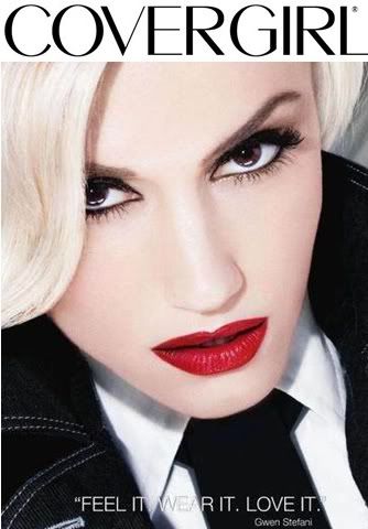
  I went with this image, partially cause it was actually used for a national ad campaign for lipstick, so experts in the business obviously like it  However, I also like the angle in which this is shot. It's something different, edgy, yet commercial. I feel that Gwen looks beautiful in this picture, but that the lips definitely stand out, highlighting the product we're meant to model this round. |
|
|
|
Post by Bethany Joy Galeotti on Feb 27, 2012 11:34:59 GMT -5
Beth: I don't think the color of your lipstick is suitable for this week shoot, since Covergirl Outlast Lipstain is focusing on Lightweight Shade but other than the color, the photo is just stunning. The angle look really good and your styling is very memorable. I love your eyes. Overall good job!!!
|
|
|
|
Post by Amanda Kimmel on Feb 27, 2012 11:45:11 GMT -5
Amanda: This is definitely a lipstick ad and it's perfect for CoverGirl - but like Beth said, it's a bit too dark for the product this time. The lips do really stand out, and your styling and eyes are incredible. This is way better than last round - even with the issue of the text on the screen seemingly being added by a rookie. I can hardly make out the "wear" given its placement. Regardless, you look flawless here - this may be the best photo this round, but the issue with it is that it doesn't advertise the product so well. The thematic relation saved you last round... so that might mean trouble... let's hope the modelesquity value of this helps!  |
|
|
|
Post by Anna Wintour on Feb 27, 2012 14:02:19 GMT -5
Anna: Now THIS is an angle that works for you! You are one of those girls that has a chin that goes on for days, so slightly leaning forward like this is definitely the way to go. Your lips are undoubtedly the focus here, so great job on that...and I must admit, I am a fan of the combination of red, black, and white. However, I wish you would have spent a minute or two finding a version of this without the text, but it's really not that big of a deal. Overall, I love the styling, I love your expression, and this is great for Covergirl (but like the others have said, the lip color doesn't quite match the product). Great job! |
|
|
|
Post by Joan Rivers on Feb 27, 2012 15:08:04 GMT -5
Joan: I like the angle a lot here, you look flawless and gorgeous. You added your own rock edge to this cover girl shoot. But I agree with the judges that the lips are too dark and heavy, when Beth said it is supposed to be lightweight so it doesn’t come out heavy like you did here. I usually don’t like to judge strictly on that since as a player it is a pain in the ass to get the exact match but when other girls follow through it is hard not to. Overall though I think this photo is wonderful and you did a good job here.
|
|